
Optimise Primary Wordmark
Optimise is a financial decision automation and software development company working across the Channel Islands and the UK. They partner with smaller financial institutions - think building societies, credit unions, and independent banks - helping them streamline their operations with low-code, high-transparency solutions. Their work is technical, but at its core, it's about people: making financial systems work better so teams can focus on what they do best.
THE CHALLENGE
When the founders approached me, they were five weeks out from a major event and needed a brand refresh, that felt professional yet approachable and made a lasting impression. With a shift towards a product-centric approach, they wanted a versatile new identity. Their vision? A modular, flexible identity that could grow with them, from marketing to digital products. Oh, and they’re a fully remote team, so this entire project happened online.
Secondary Lock-up (horizontal)
The Process
1️⃣ Defining the Brand’s Core - From Concept to Cohesive Identity
We kicked off with a deep dive into Optimise’s personality and values, which shaped every design decision.
Optimise’s key traits:
✔ Hands-on & helpful - They simplify the complex.
✔ People-first - Their tech empowers teams.
✔ Playful yet professional - Smart, but never stiff.
✔ Hands-on & helpful - They simplify the complex.
✔ People-first - Their tech empowers teams.
✔ Playful yet professional - Smart, but never stiff.
They wanted to stand out in a sea of corporate competitors. That meant moving away from sterile fintech aesthetics and embracing something more vibrant and dynamic.
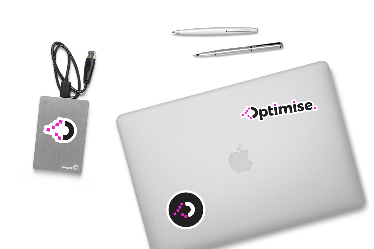
Optimise merch created for event showcase
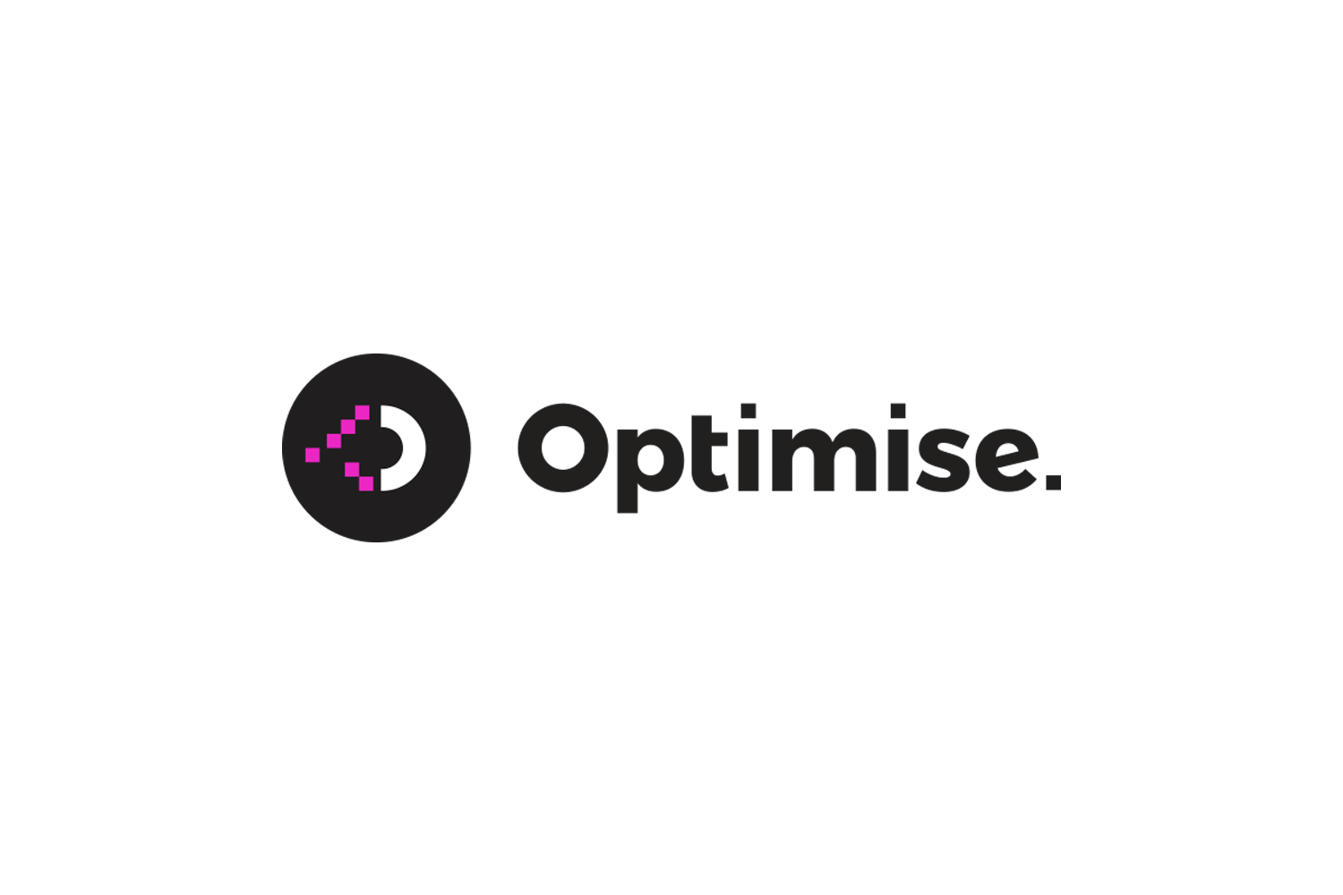
2️⃣ Logo Exploration - Crafting a Visual Identity
Inspired by their low-code, automation-driven approach, I explored themes of connection, transformation, and clarity.
I developed six logo concepts, each reflecting a different brand strength: Create, Accelerate, Transform, Unify, Operate, and Connect. The standout? Transform.
The founders loved how it captured their role as the missing piece, bringing together technology and people. I refined the logotype, customising the "O" into a perfect circle and squaring the dots on the "i"s to mirror pixel elements, reinforcing their digital focus. Resulting in a fresh, playful-yet-professional logo system, complete with submarks and secondary lock-ups.
For the colour palette, we struck a balance between energy and professionalism:
🔹 Pantone 807C (electric pink) - Bold and forward-thinking.
🔹 Cool turquoise & off-black - Sleek, modern, and highly legible.
🔹 Pantone 807C (electric pink) - Bold and forward-thinking.
🔹 Cool turquoise & off-black - Sleek, modern, and highly legible.
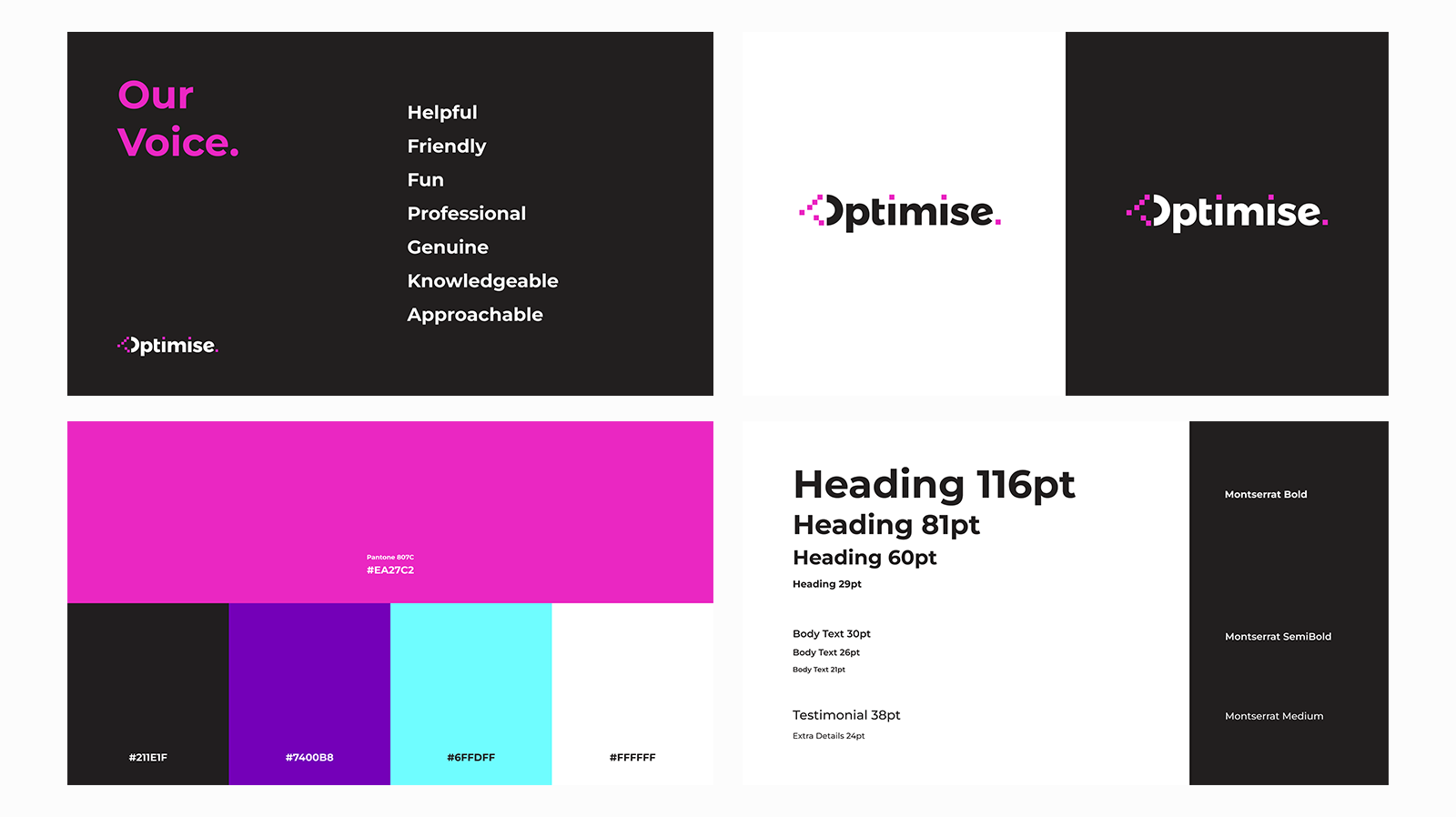
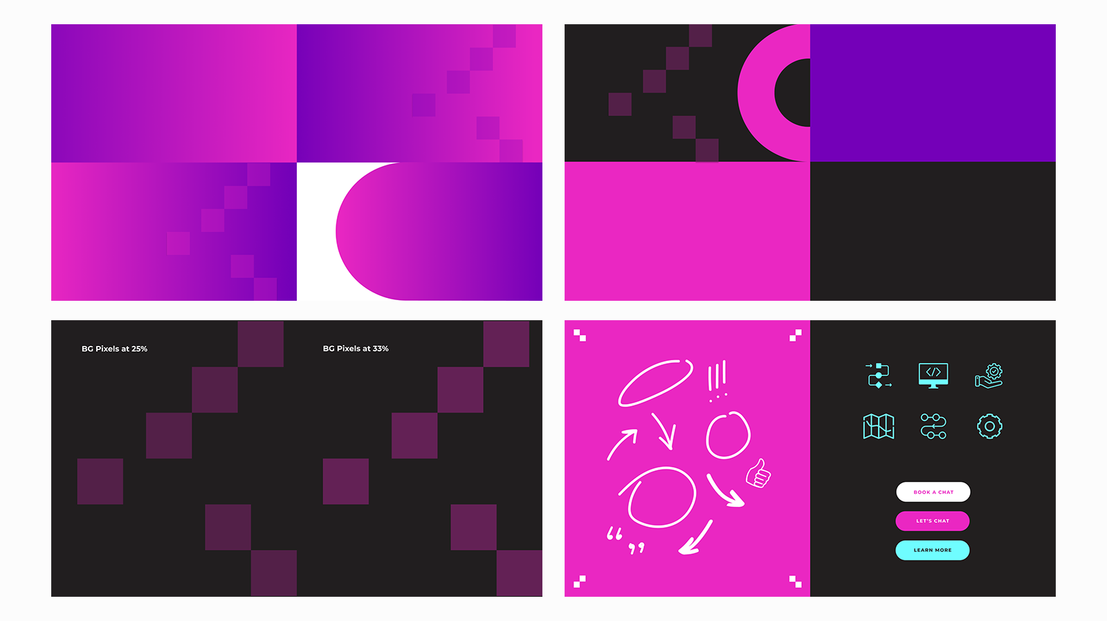
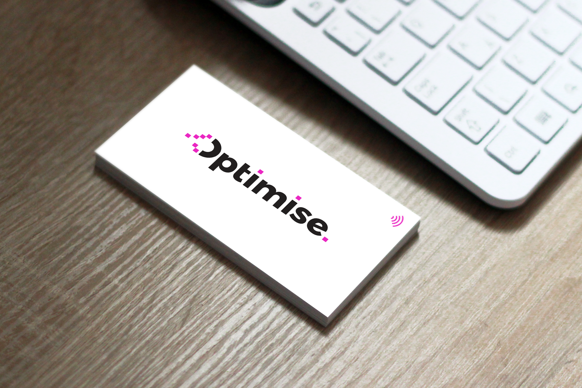
Extracts from Brand Style Guide
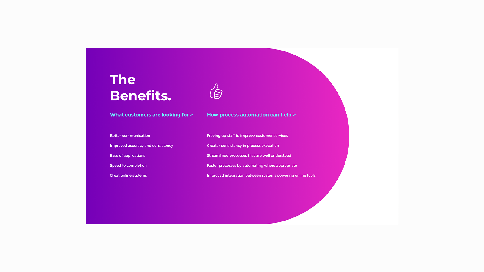
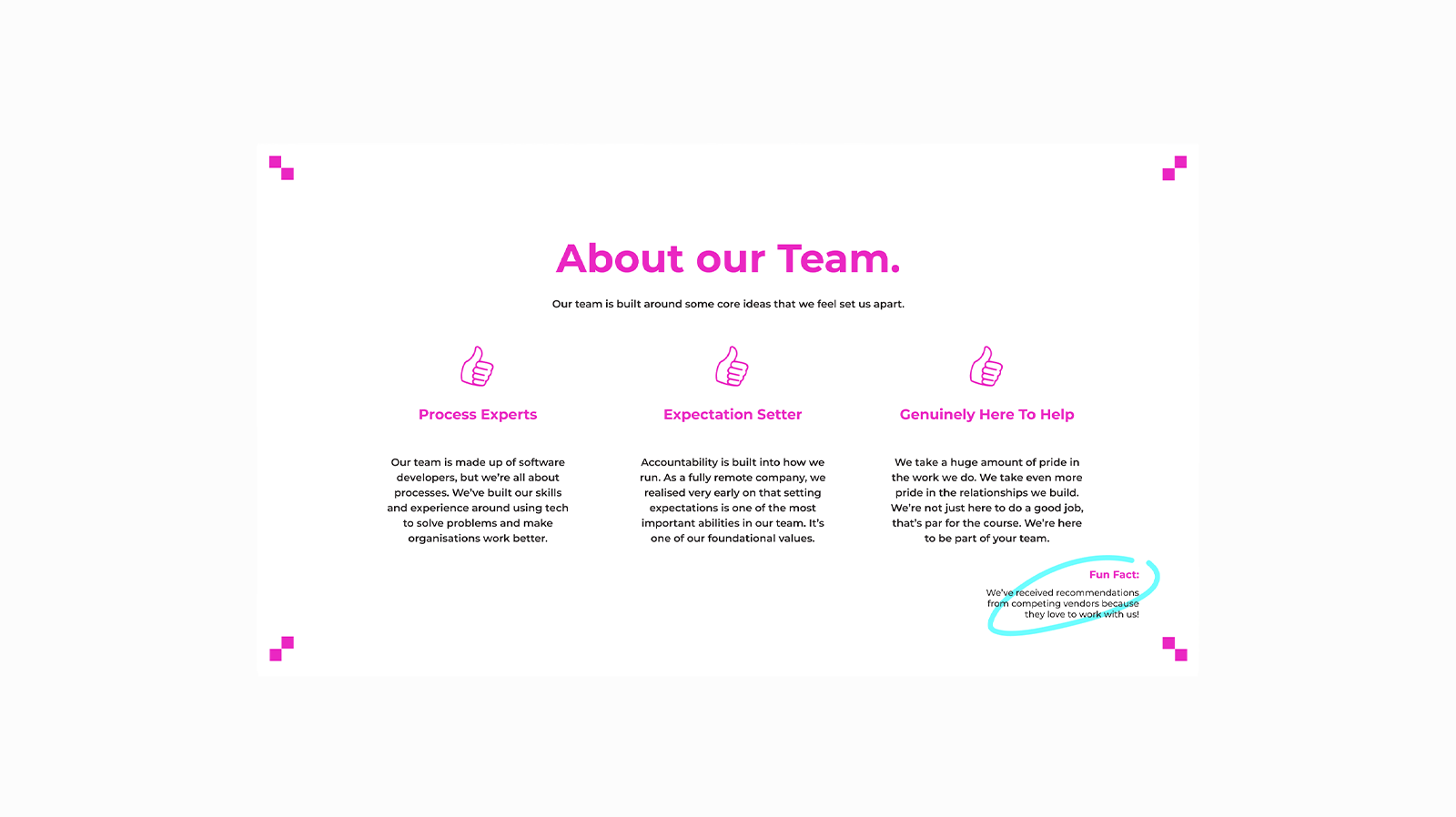
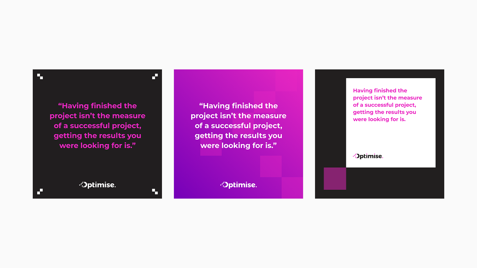
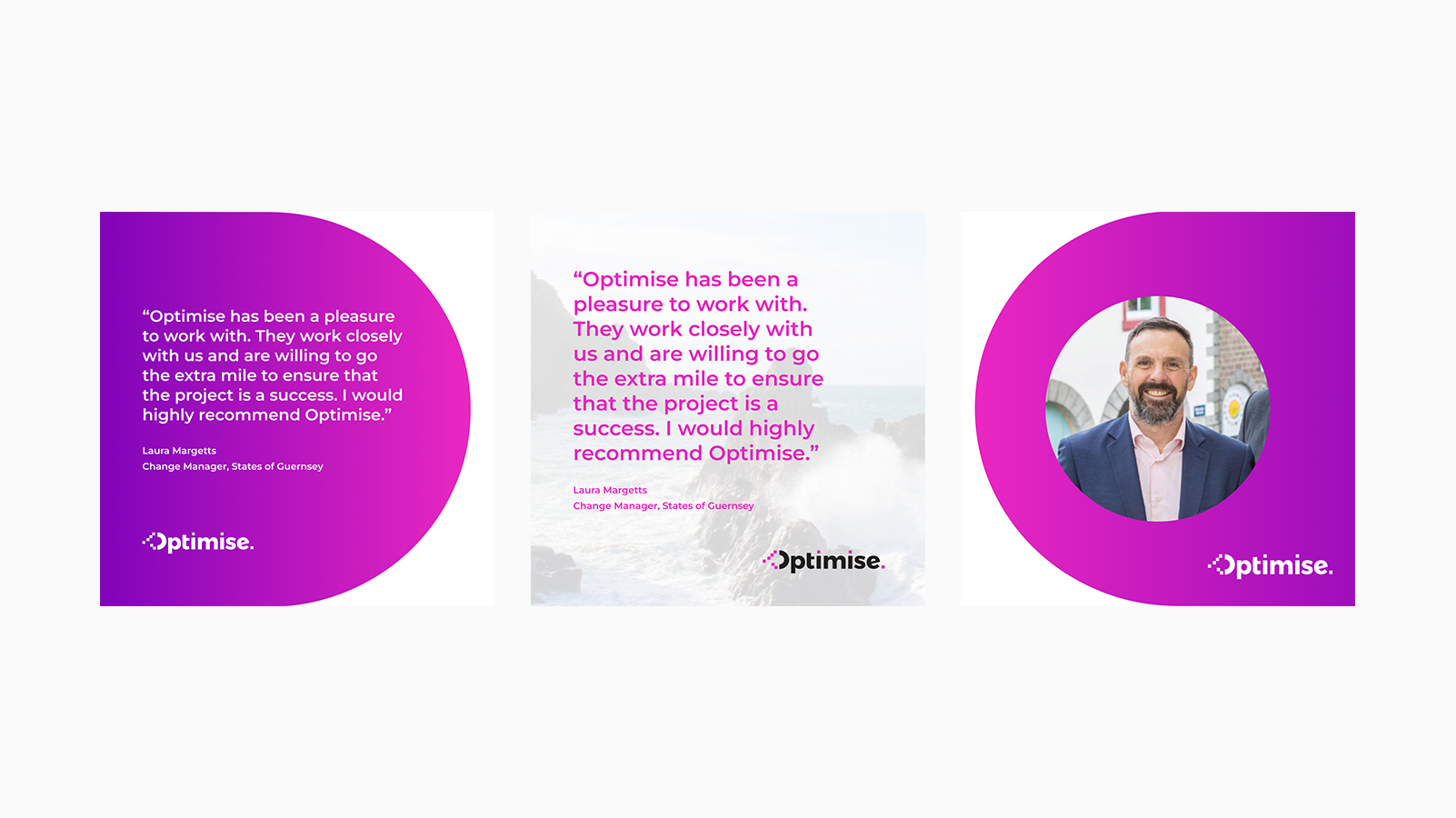
3️⃣ Building a Versatile Brand Toolkit
With the identity locked in, I expanded the branding system to ensure consistency across all digital and physical touchpoints:
✔ Pitch Deck & Social Media Templates - Since the team works in Figma, I built fully customisable assets, ensuring brand consistency across presentations and LinkedIn content.
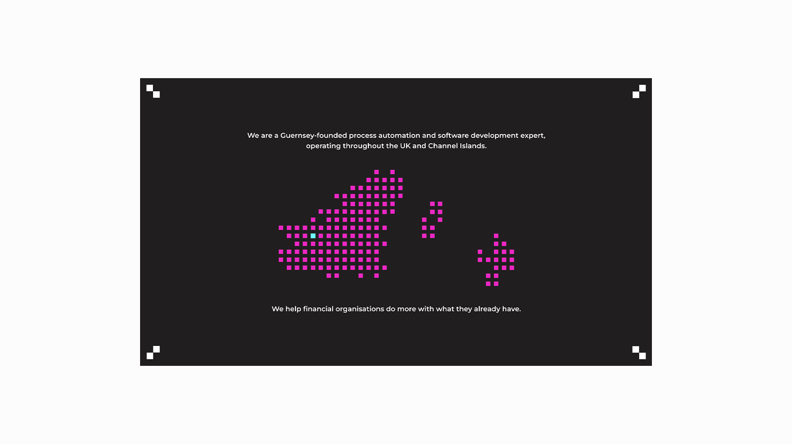
✔ Website Refresh - I repurposed key elements into a sleek, intuitive design with a custom pixel-based menu icon and a standout Guernsey map graphic - a small touch that the team loved.
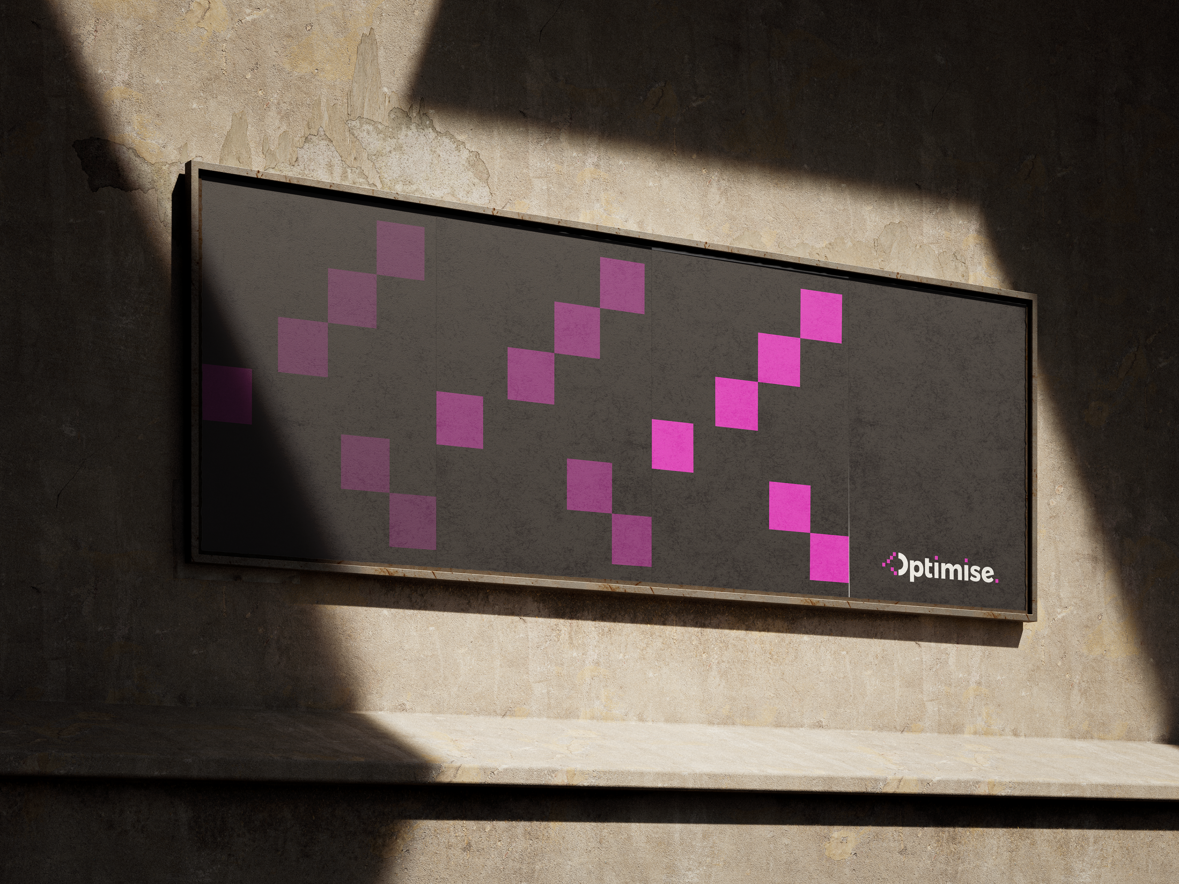
✔ Event Merch - We designed bold, on-brand swag for their upcoming showcase, ensuring the new identity left a lasting impact.
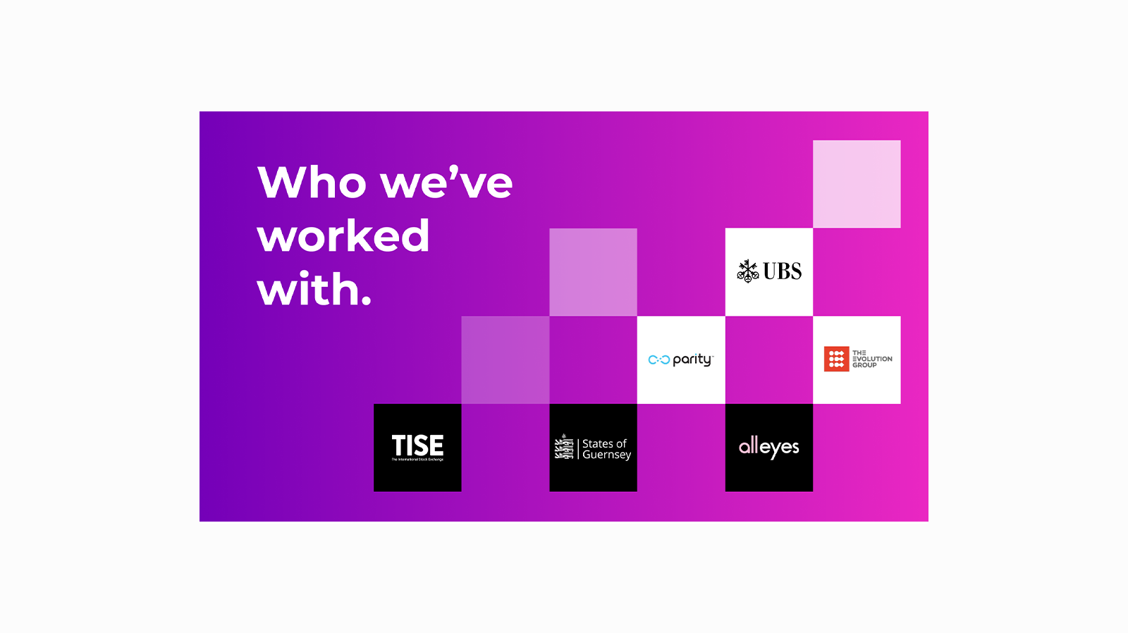
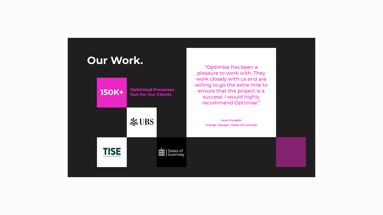
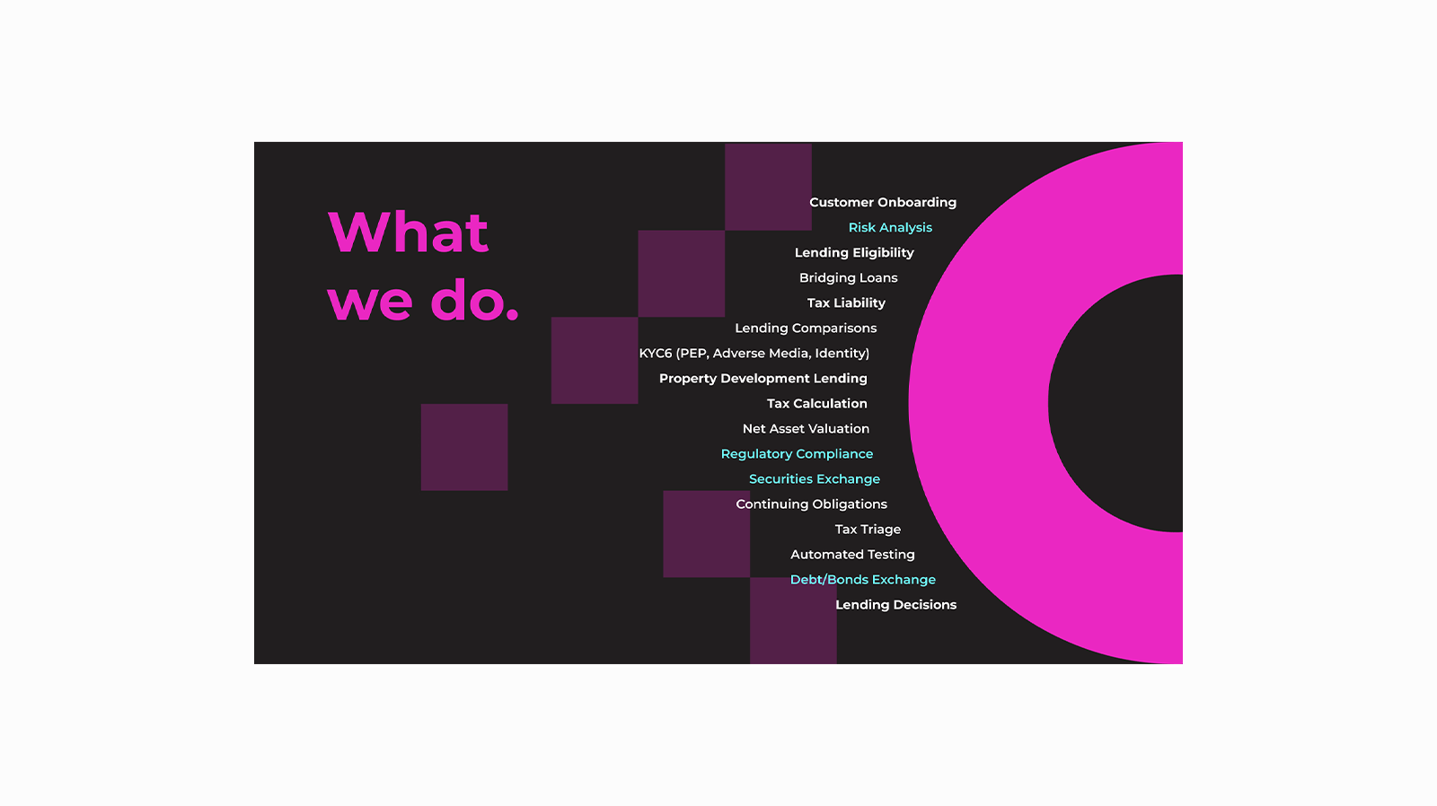
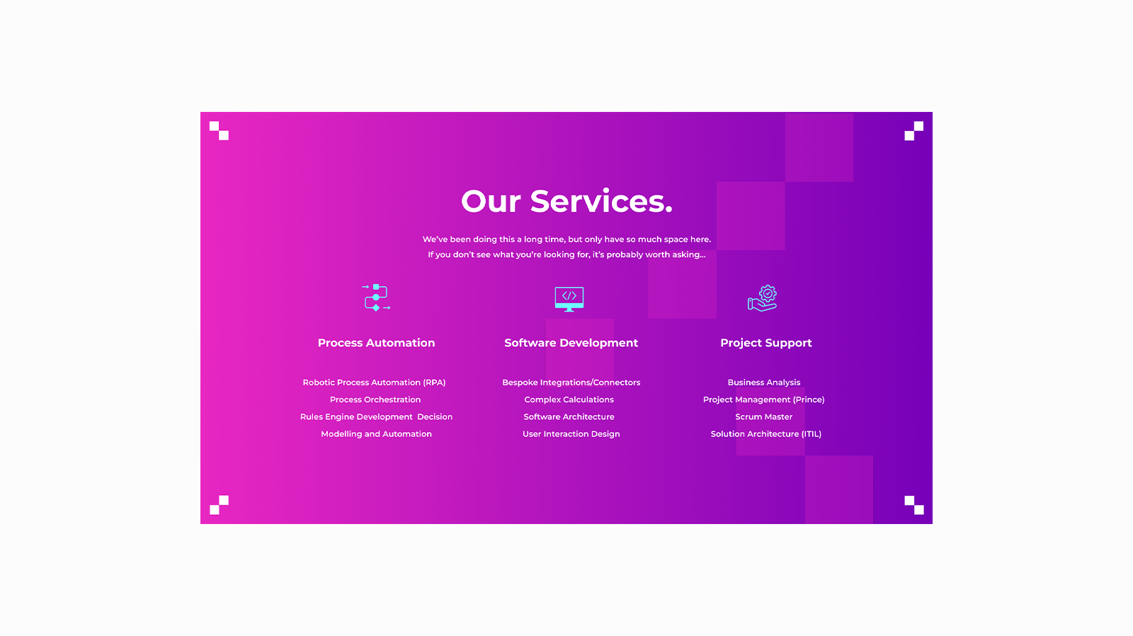

Extracts from Pitch deck template
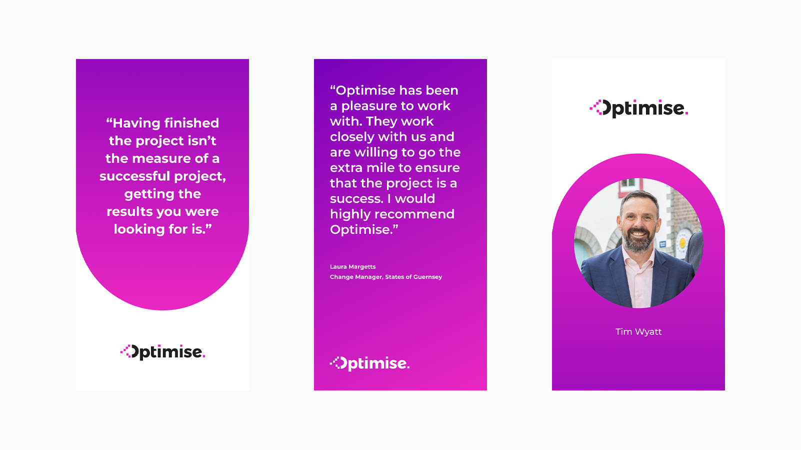
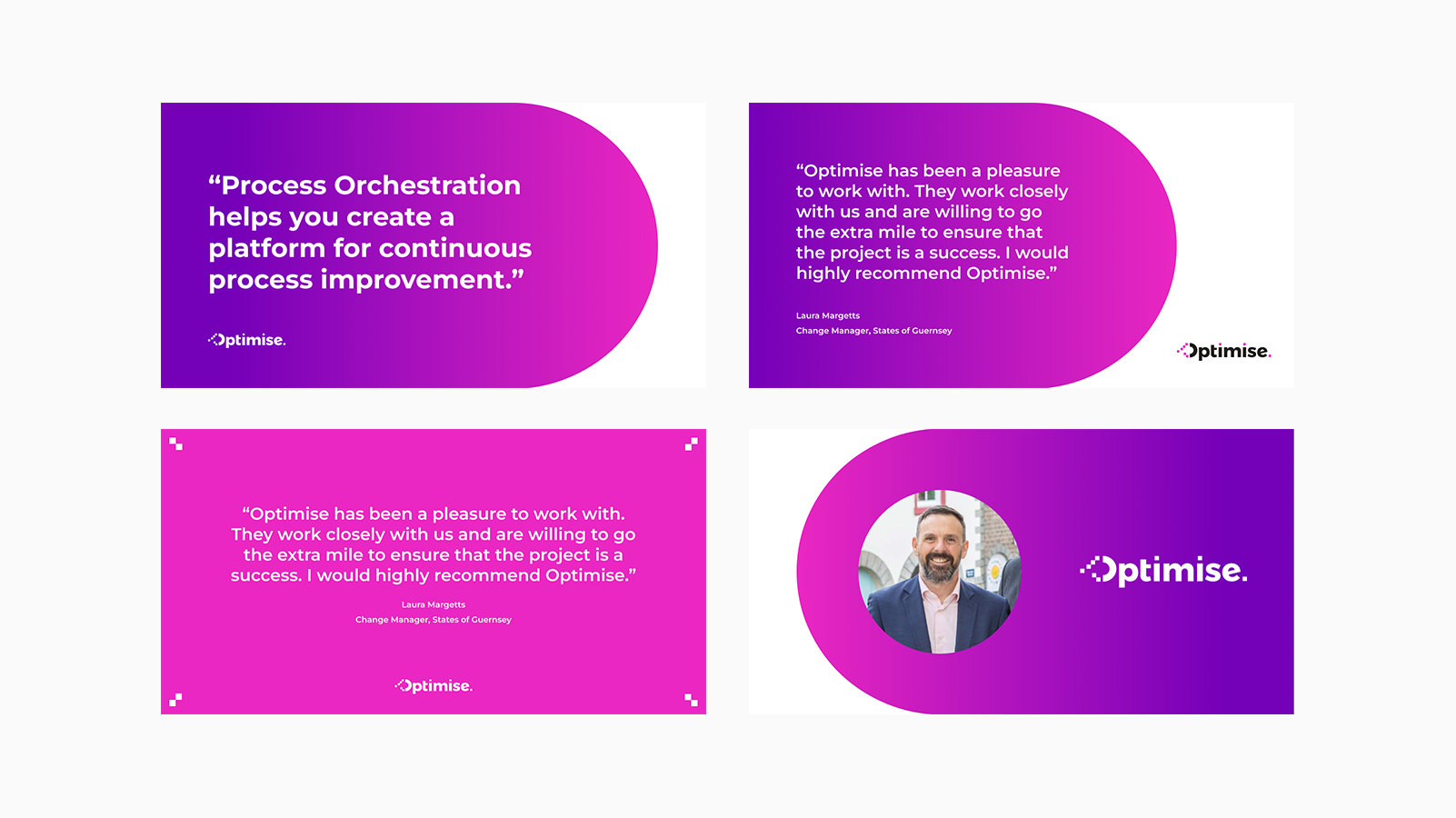
Section of LinkedIn Templates for 3 different styles of post
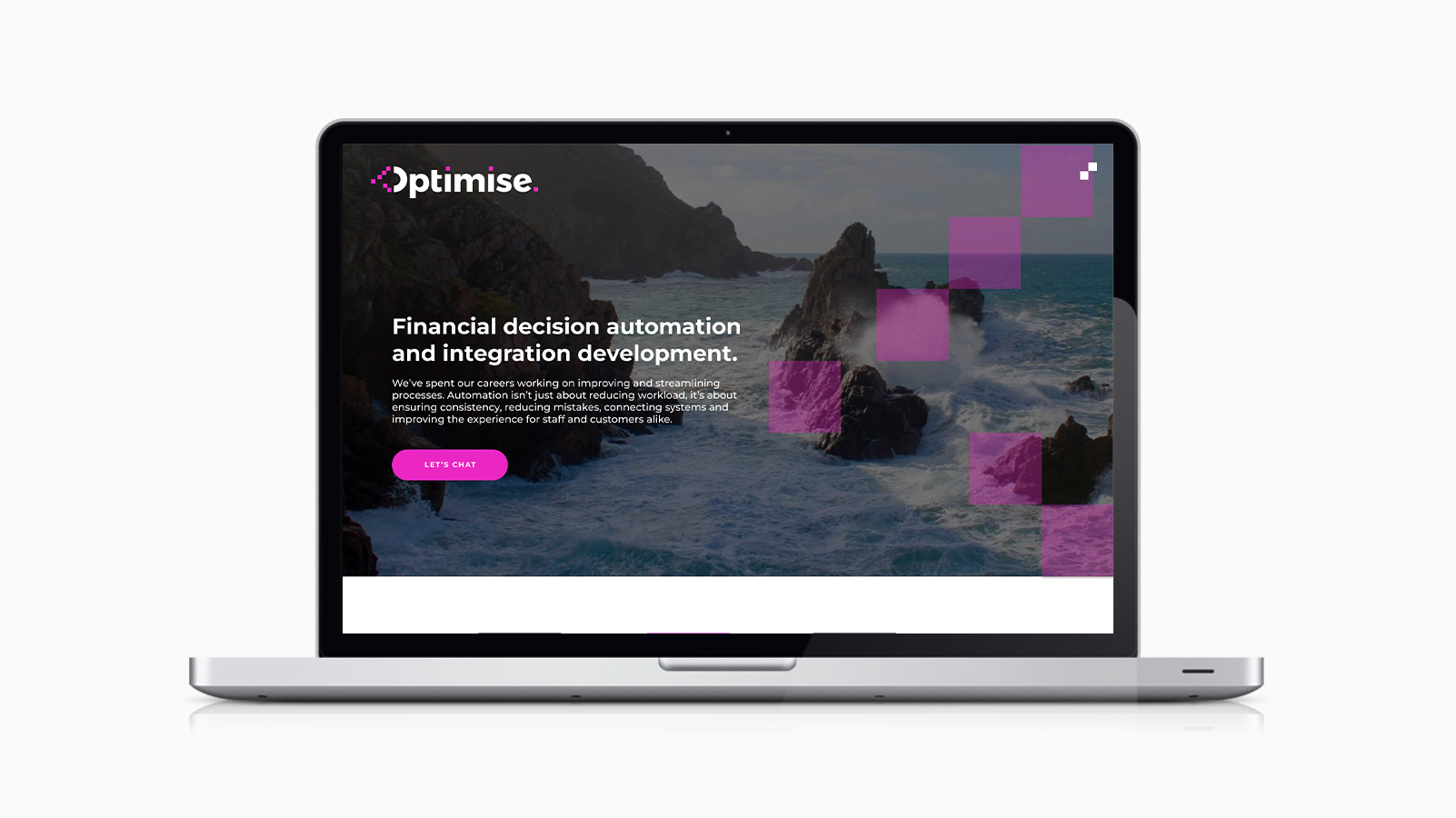
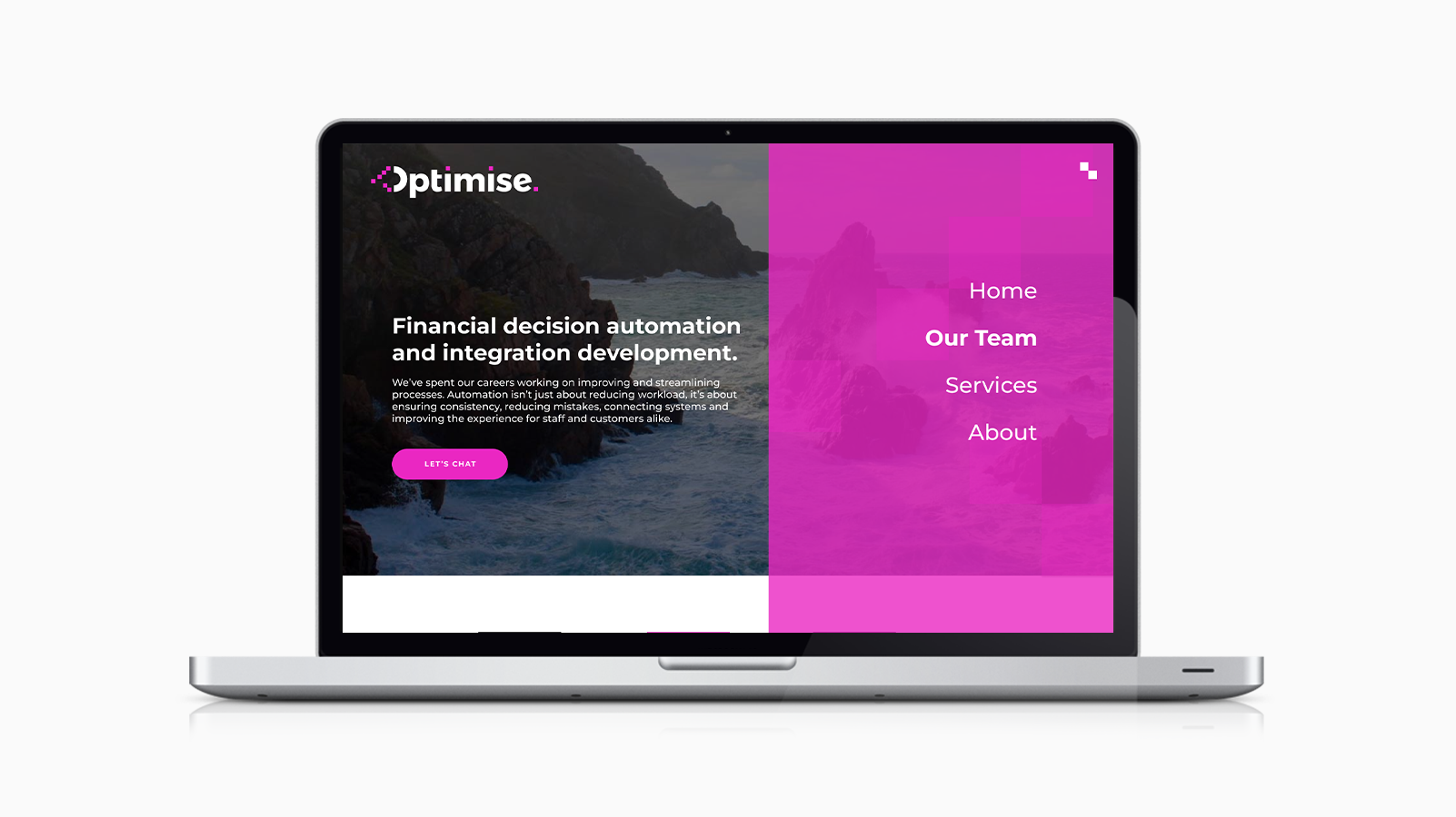
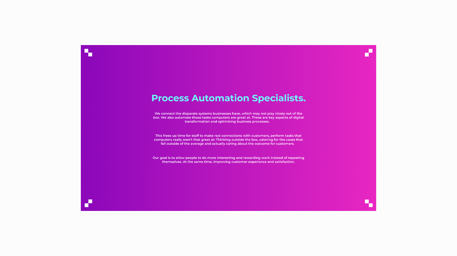
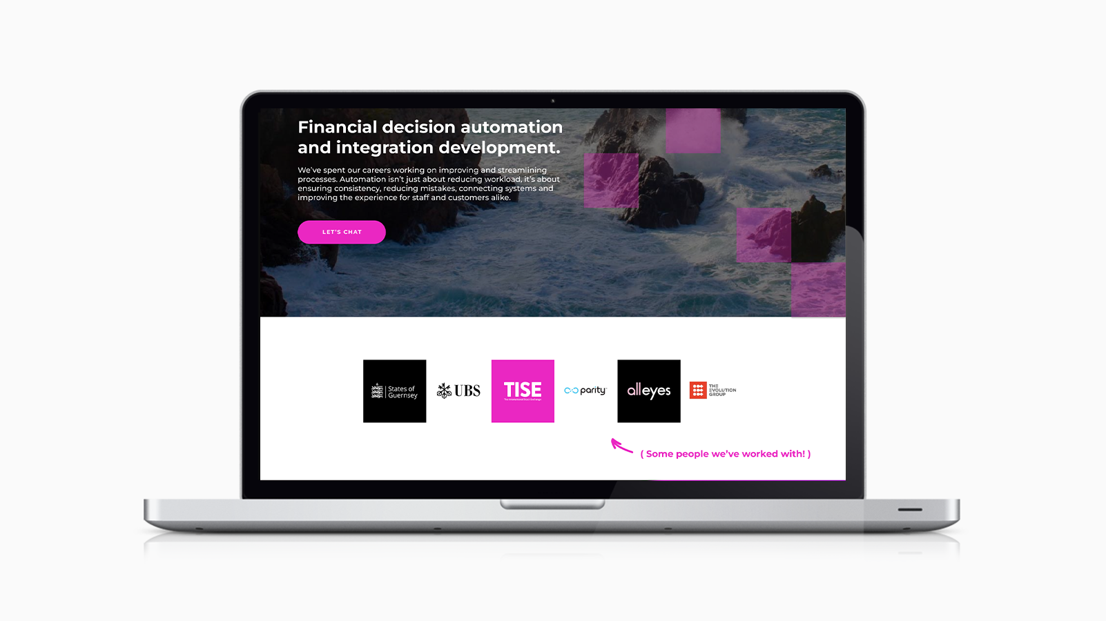
Optimise Landing Page and side navigation
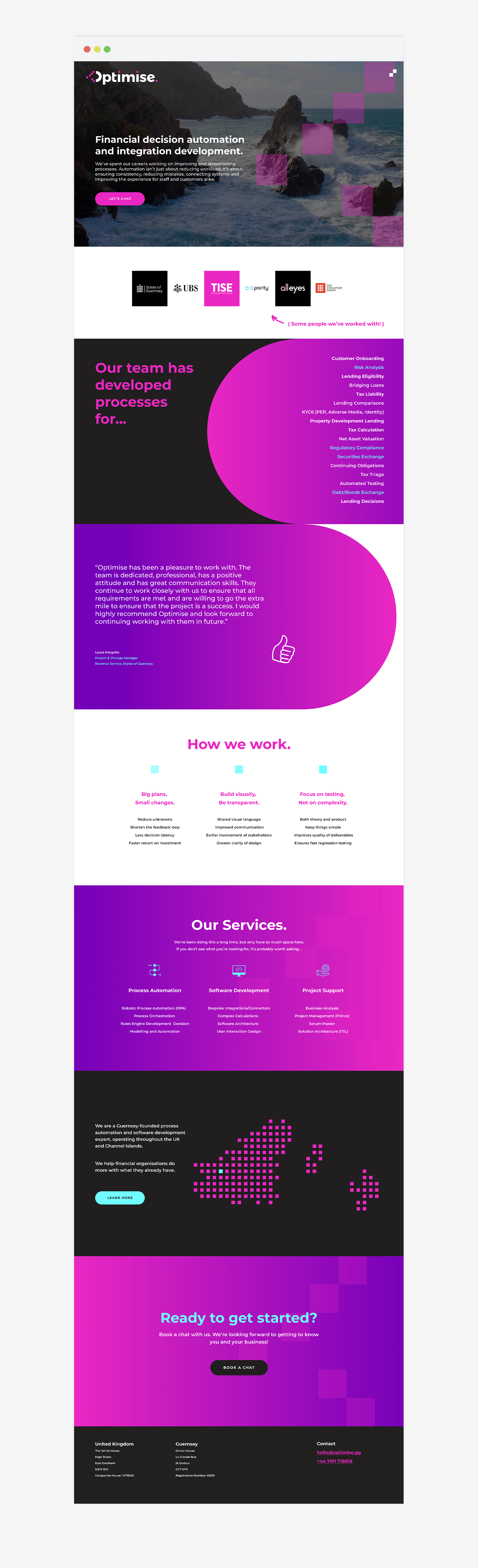
Full view of Landing Page
THE RESULT
A Brand that feels like Optimise.
When I presented the final branding, the reaction was instant:
🔥 “Nifty.” (Their words, not mine.)
🔥 “Nifty.” (Their words, not mine.)
The pitch deck templates hit the mark, providing a flexible structure they could adapt as needed. The website redesign felt polished yet approachable, and the pink absolutely popped on their event merch.
Most importantly, the branding finally felt like them - a company that’s smart, innovative, and genuinely here to help.
Deliverables:
✔ Logo System (Primary, Secondary, Submark)
✔ Pitch Deck & Social Templates (in Figma)
✔ Website Design (in Figma)
✔ Branding Guide (Colour palette, typography, assets)
✔ Pitch Deck & Social Templates (in Figma)
✔ Website Design (in Figma)
✔ Branding Guide (Colour palette, typography, assets)
Key Takeaways:
💡 Great branding should tell a story - even in the smallest details
💡 Never underestimate the power of a strong, flexible colour palette
💡 Prioritisation = Everything
💡 Constraints (like an 5-week deadline) fuel creativity
💡 Never underestimate the power of a strong, flexible colour palette
💡 Prioritisation = Everything
💡 Constraints (like an 5-week deadline) fuel creativity
Tech Used: Adobe Illustrator / Adobe Photoshop / Figma
Services provided: Logo Design / Branding / Web Design / Digital Design