

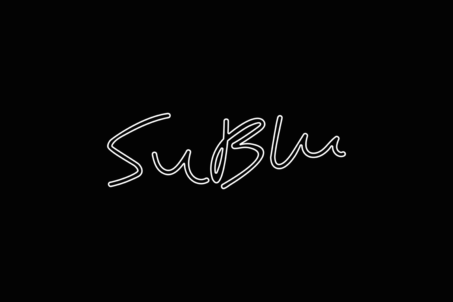
SuBlu Primary Logo
A Digital Identity & Platform for an Alternative Camera Artist
SuBlu is an alternative camera artist exploring perception, mental health, and self-reflection through smartphone photography image-making.
Working exclusively on a Google Pixel, her practice rejects traditional photography - resulting in work that feels raw, immediate, and deeply personal.
The challenge was to translate this body of work into a structured digital platform that not only preserved its artistic intent, but also guided audiences through it in a clear, engaging, and accessible way.
The Challenge
The work existed as a large, unstructured archive with no defined system for navigation, hierarchy, or presentation. Alongside this, there was no cohesive brand identity to support or frame the practice.
This created friction in how audiences experienced the work - making it difficult to understand themes, navigate series, or engage with the artist’s wider narrative.
Key challenges included:
• No clear brand system to support the practice
• Large volumes of content with no structured hierarchy
• No defined user journey through themes or collections
• Lack of clarity in how audiences engage with the work
• Need to balance emotional expression with usability and flow
• No clear brand system to support the practice
• Large volumes of content with no structured hierarchy
• No defined user journey through themes or collections
• Lack of clarity in how audiences engage with the work
• Need to balance emotional expression with usability and flow
The core challenge was to create structure and intent - turning passive viewing into active exploration and understanding.
The APPROACH
I approached the project as a combination of brand design, content strategy, and experience design - focused on reducing friction and improving how the work is understood and explored.
The goal was to create a clear, navigable system that enables clarity and progression, while preserving the rawness and emotional integrity of the imagery.
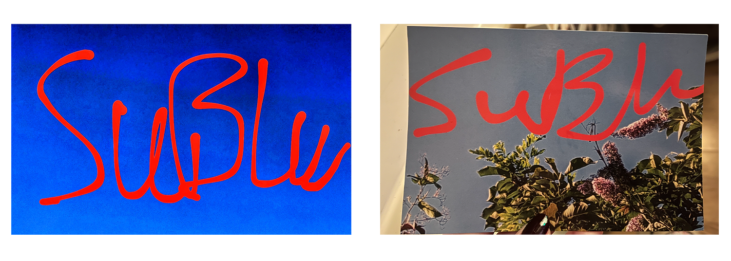
Original Logo Sketches by SuBlu
Logo Exploration - Crafting a Visual Identity
The logo was redrawn and refined from SuBlu’s original sketch (above), maintaining its raw, hand-drawn character while improving balance, legibility, and scalability.
A secondary eye motif - taken directly from SuBlu’s own artwork - was introduced as a supporting brand element, reinforcing recognition across touchpoints and strengthening brand consistency.
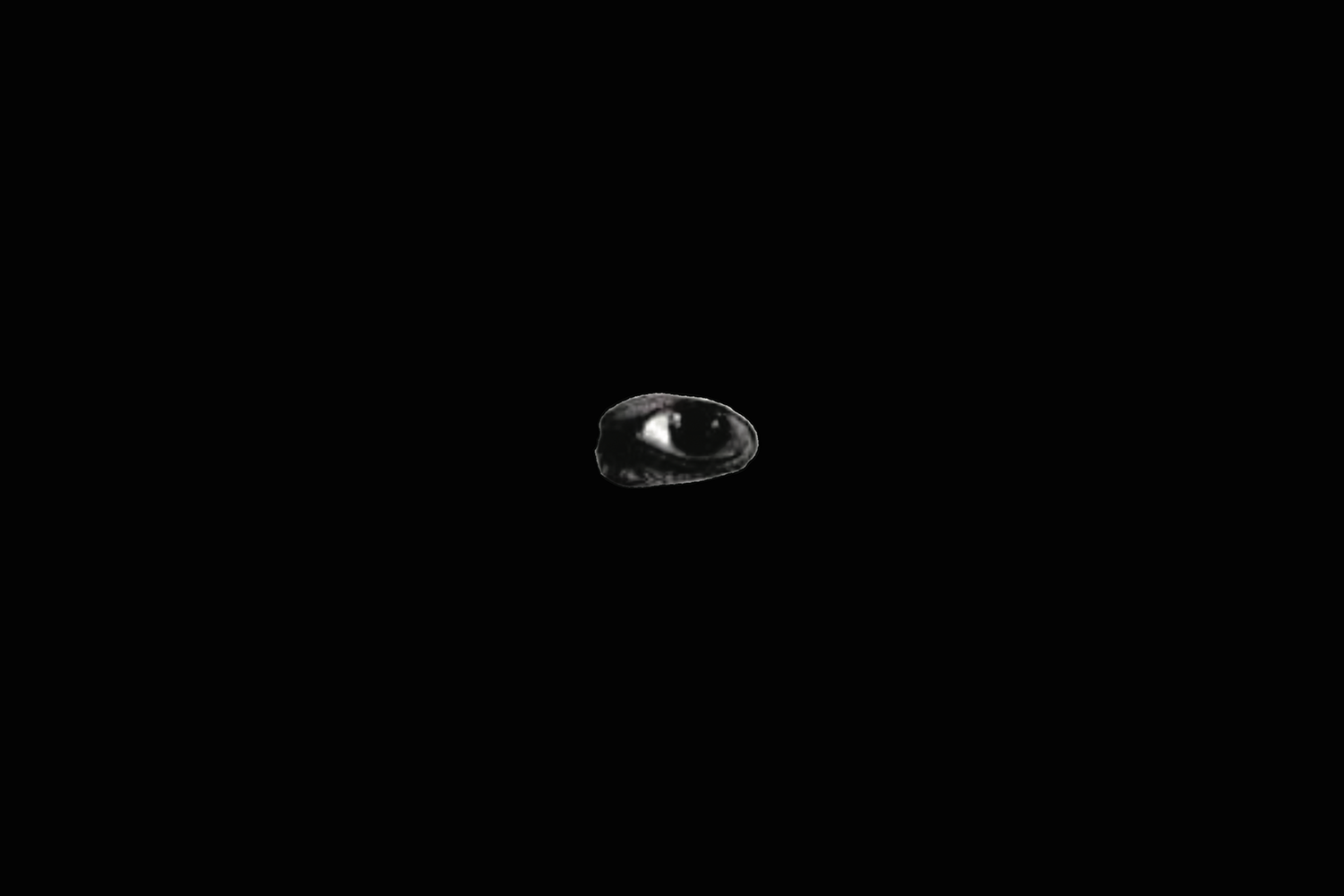
SuBlu Secondary Logo + Supporting Asset
Defining the Brand’s Core - From Concept to Versatile Brand Identity
The identity was built around SuBlu’s central concept: challenging perception and encouraging introspection through imagery.
A restrained but impactful visual system was developed, anchored by a deep blood red used consistently across digital and print touchpoints. This created both recognition and emotional weight across the platform.
A restrained but flexible design system was created, including typography, spacing, and colour rules.
The system was intentionally kept minimal to ensure the artwork remained the focus, while still providing enough structure to support navigation, hierarchy, and consistency across formats.
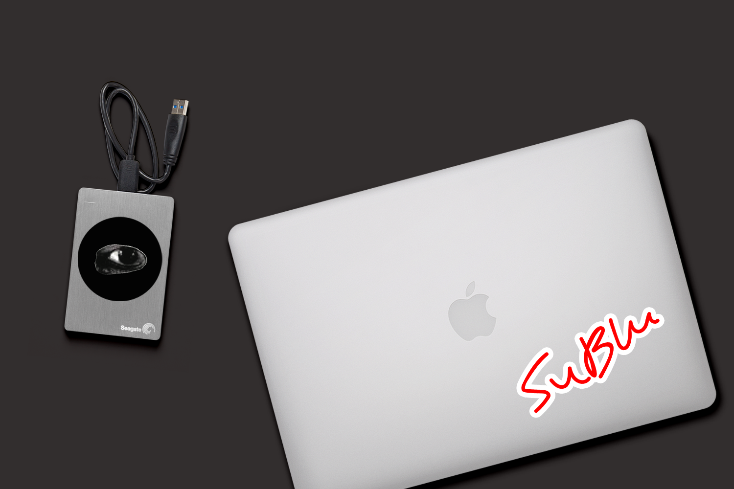
SuBlu Merch
DESIGN & EXECUTION
Content Curation & Structuring (c/o Google Drive)
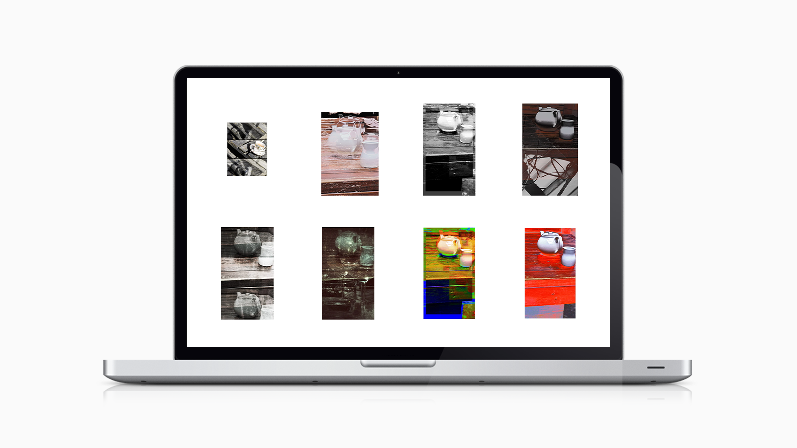
A key part of the project involved restructuring and refining the archive - organising work into coherent groupings and selecting pieces that best support the narrative of each collection.
This created a clearer relationship between individual works and the wider practice.
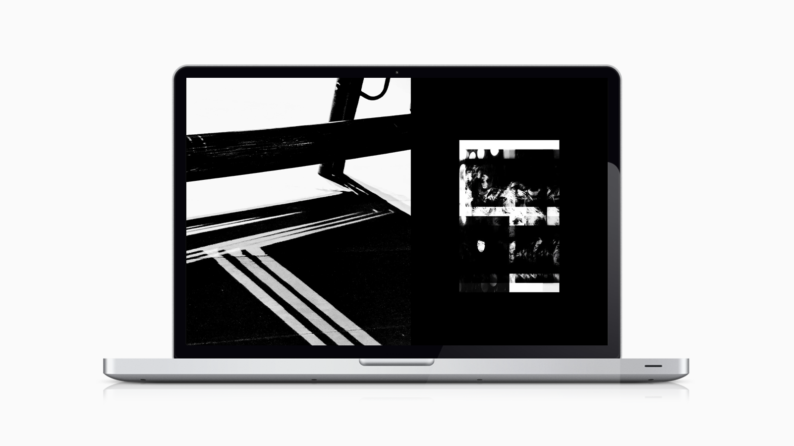
The website was designed as a structured portfolio and evolving digital exhibition space - shifting the work from archive to curated experience.
Rather than presenting work as a flat archive, the platform introduces clear pathways for exploration.
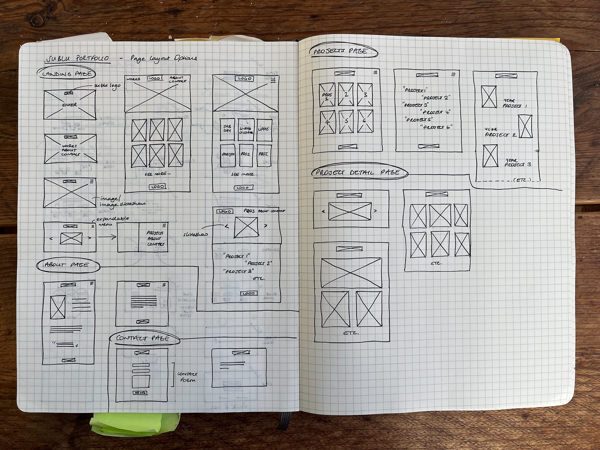
Initial Wireframe Sketches - Landing Page, About, Contact, Projects
Key features include:
✔ Curated landing page acting as a structured entry point into the practice
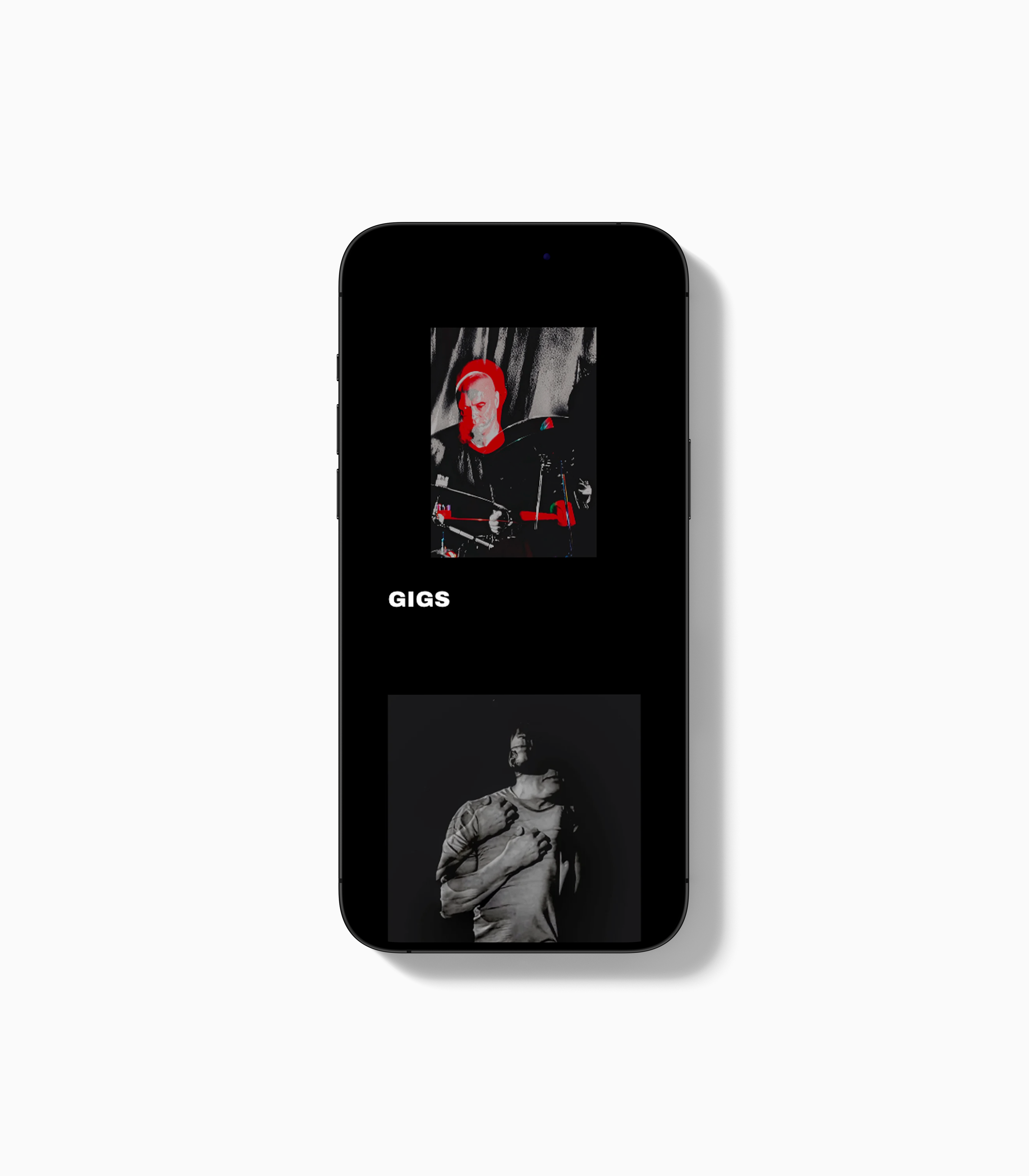
✔ Defined project collections (Self Poor Traits, Narratives, Explorations)
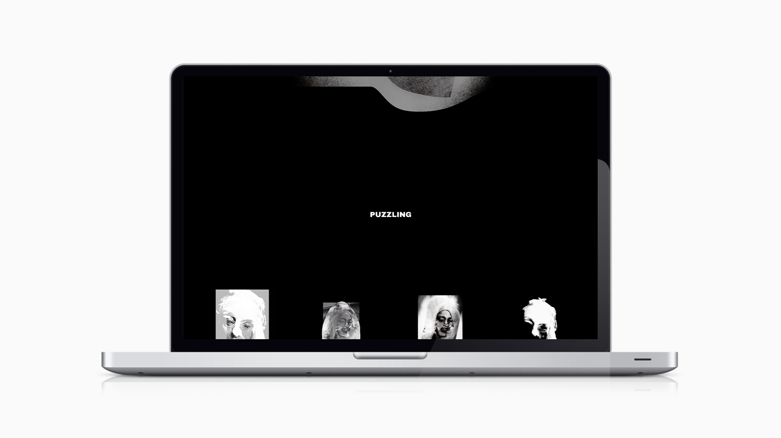
✔ Password-protected Showcase - a rotating digital exhibition space (launched with RIVERSIDE)
✔ Minimal About and Contact pages to support clarity and focus
✔ Curated landing page acting as a structured entry point into the practice
✔ Defined project collections (Self Poor Traits, Narratives, Explorations)
✔ Password-protected Showcase - a rotating digital exhibition space (launched with RIVERSIDE)
✔ Minimal About and Contact pages to support clarity and focus
A significant part of the process involved content editing - reducing and organising a large body of work into a refined, intentional selection suitable for digital presentation.
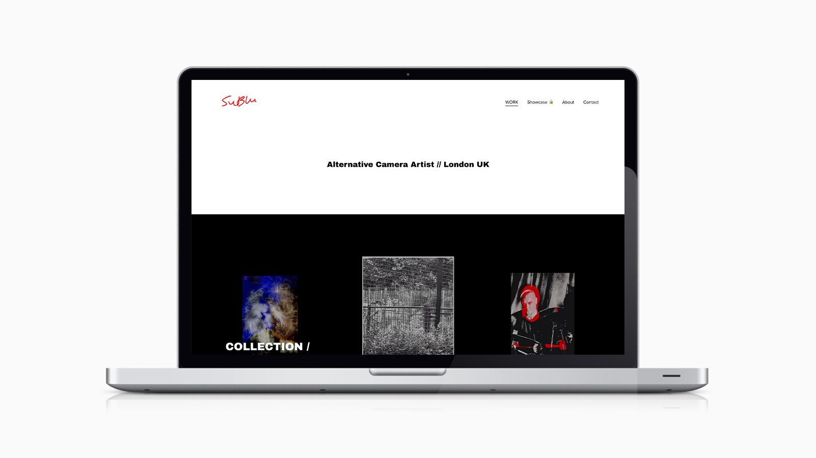
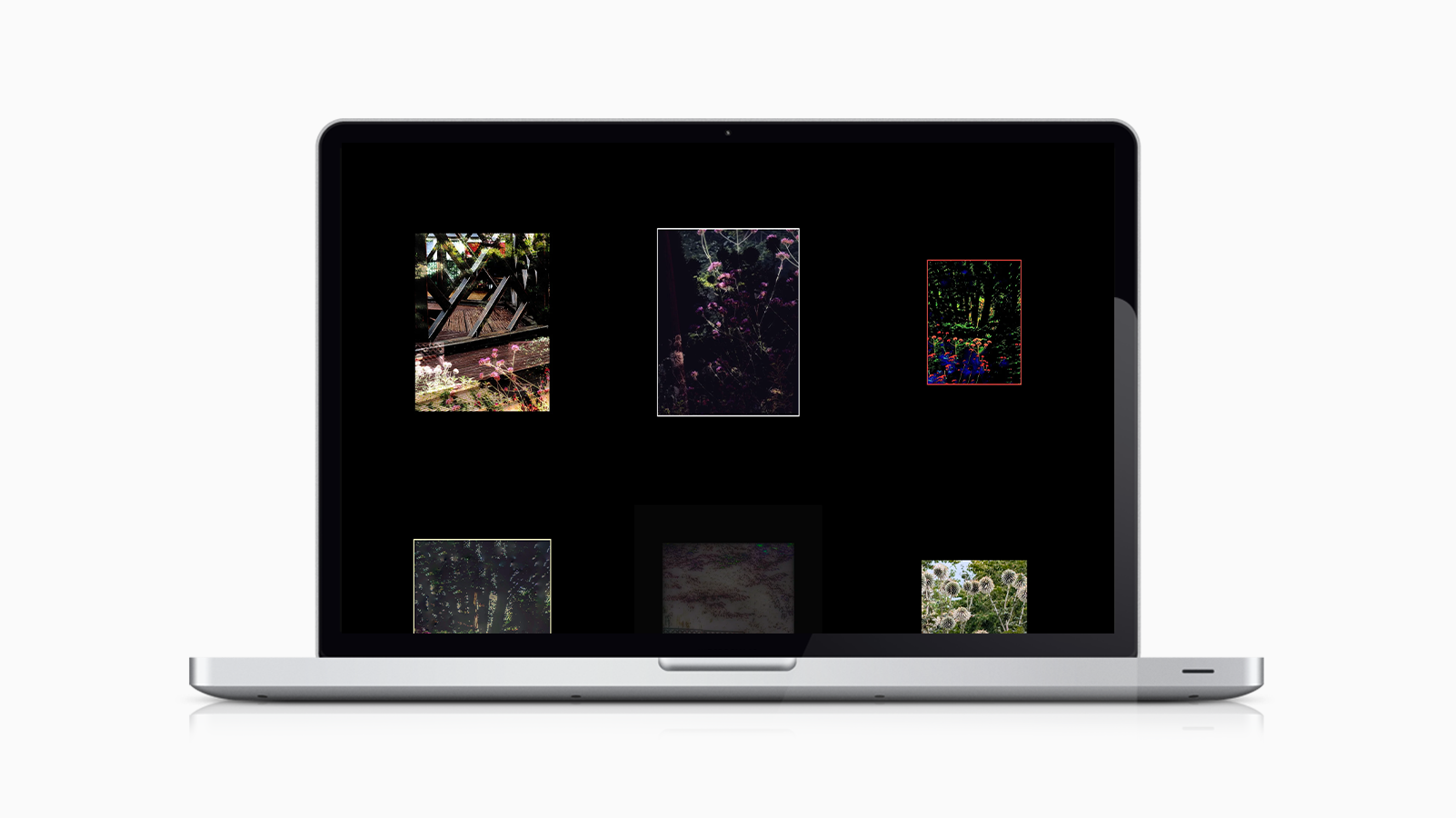
SuBlu.co.uk Landing Page on Desktop
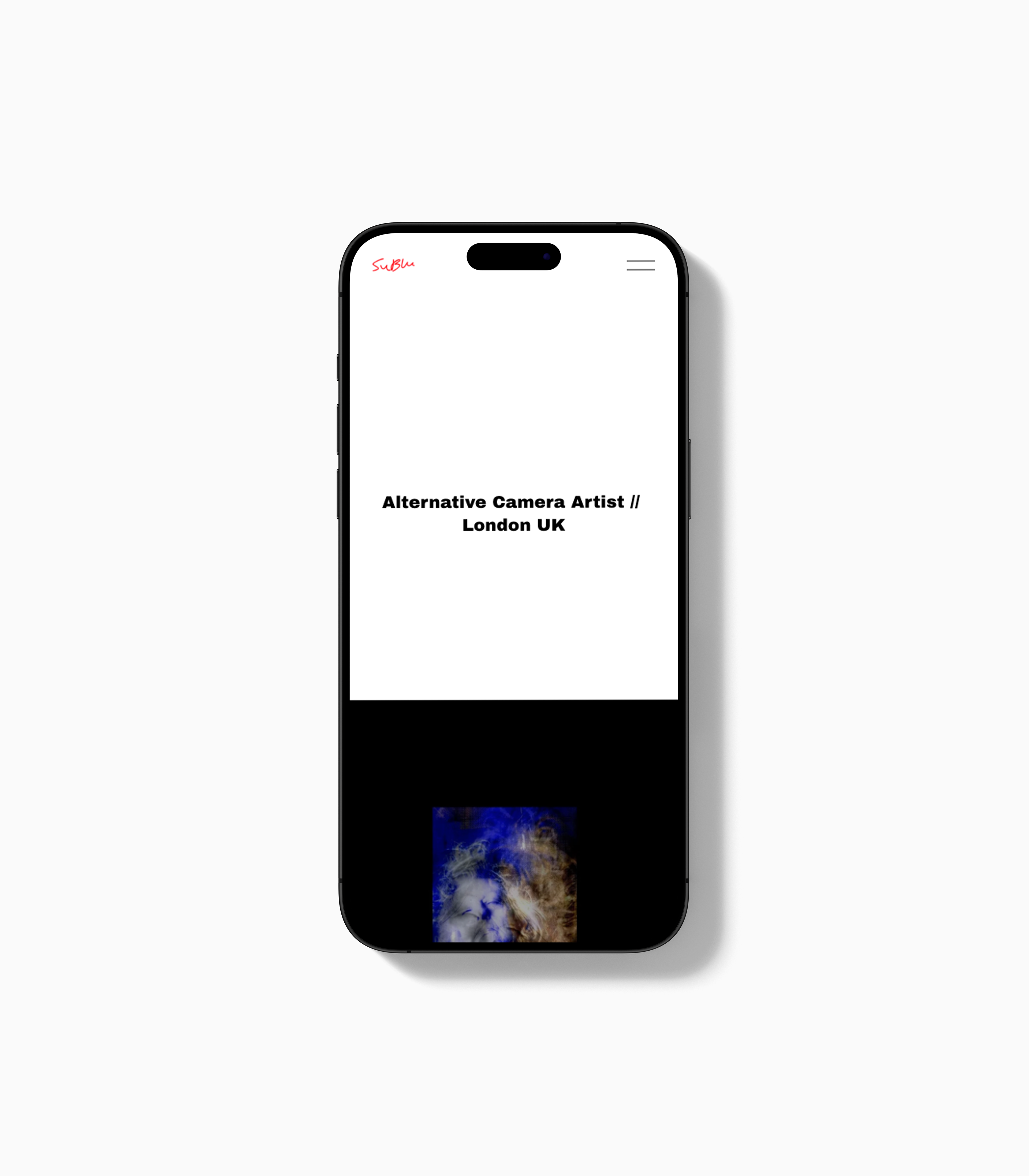
SuBlu.co.uk Landing Page on Mobile
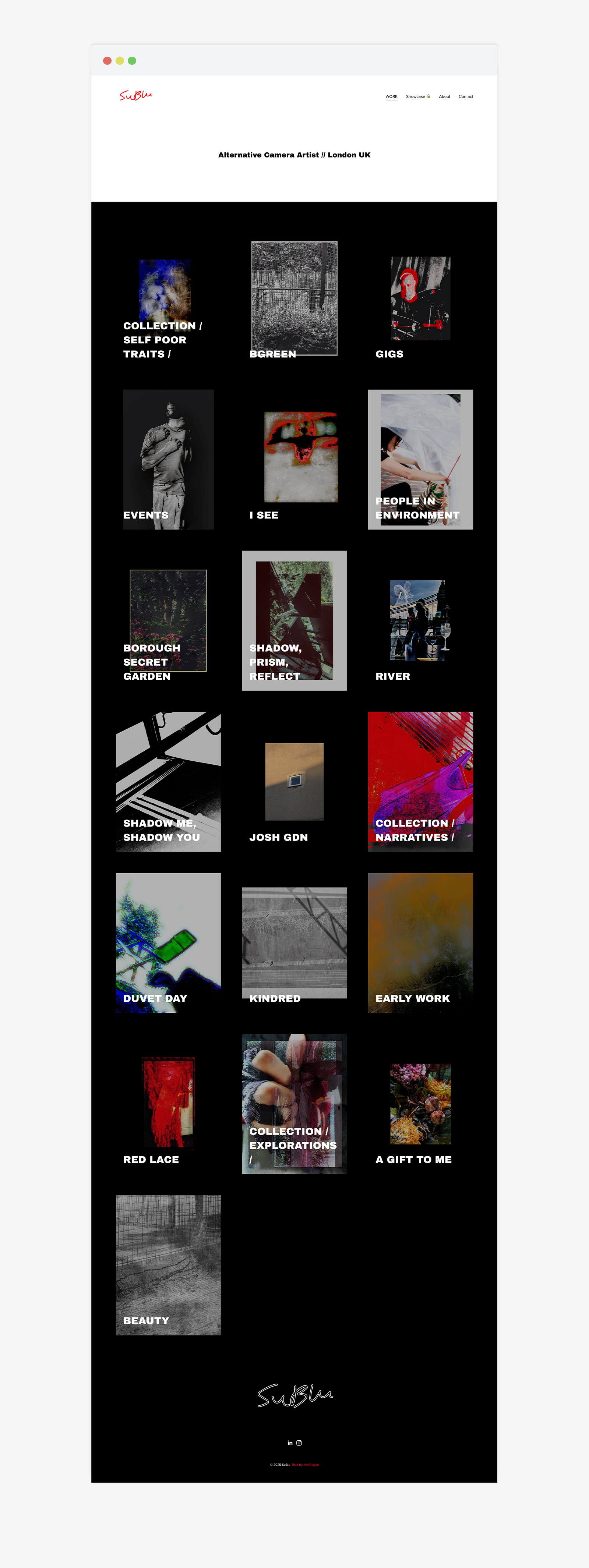
SuBlu.co.uk Landing Page Full View
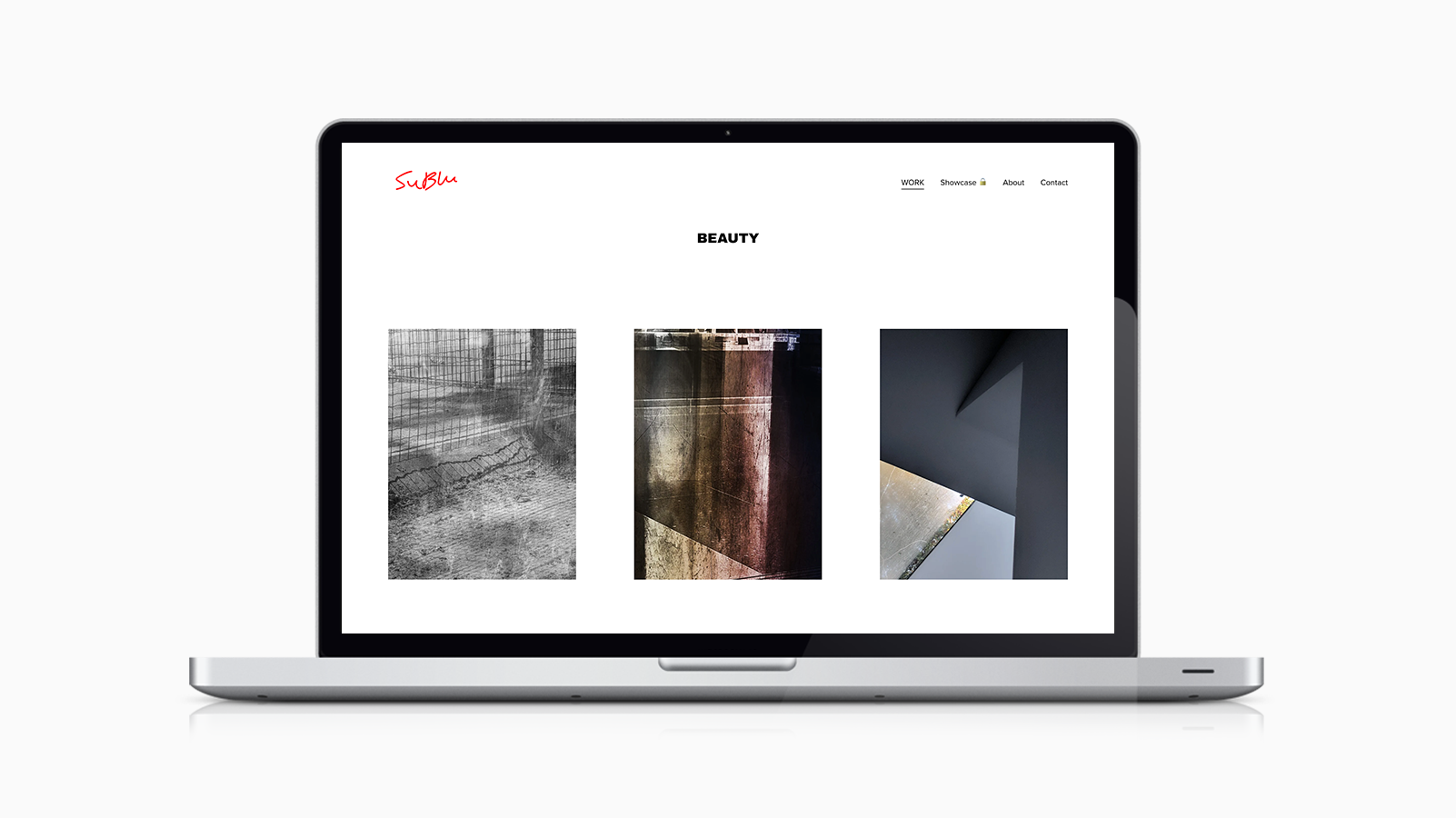
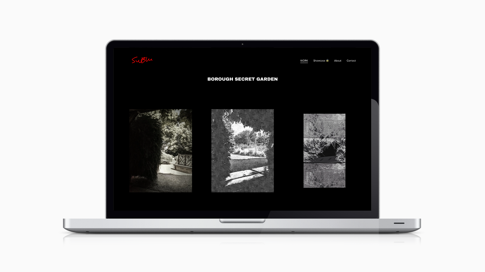
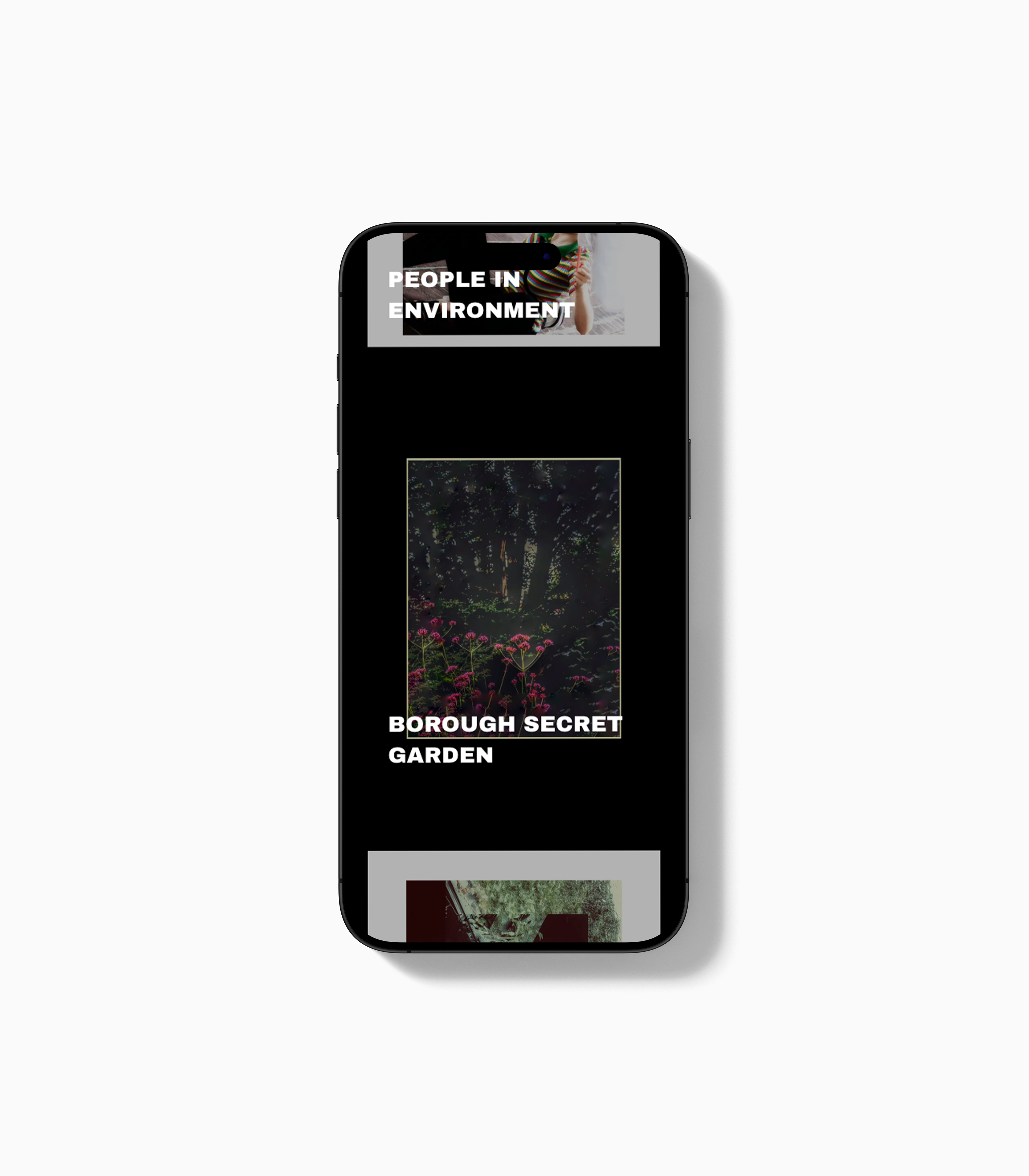
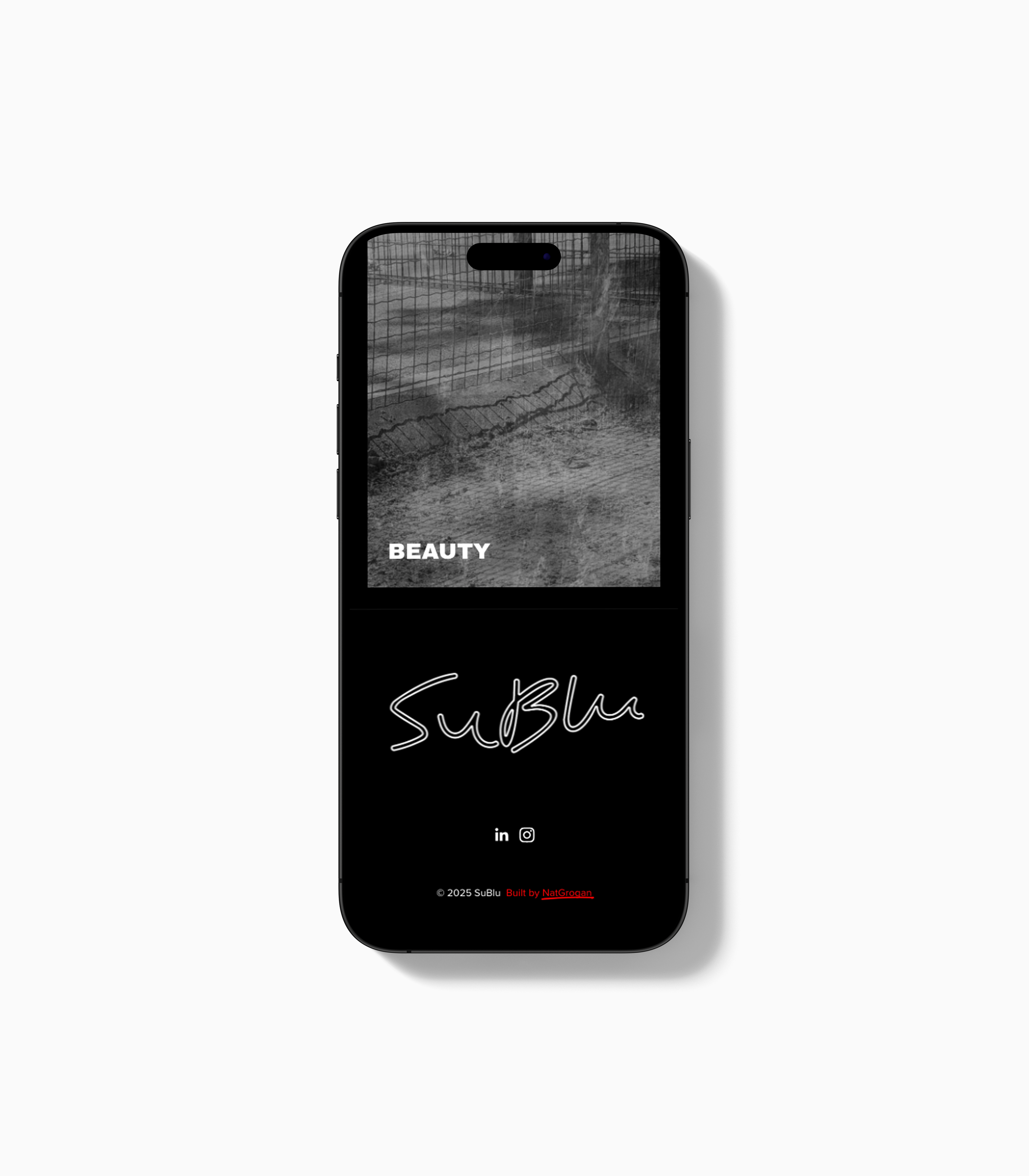
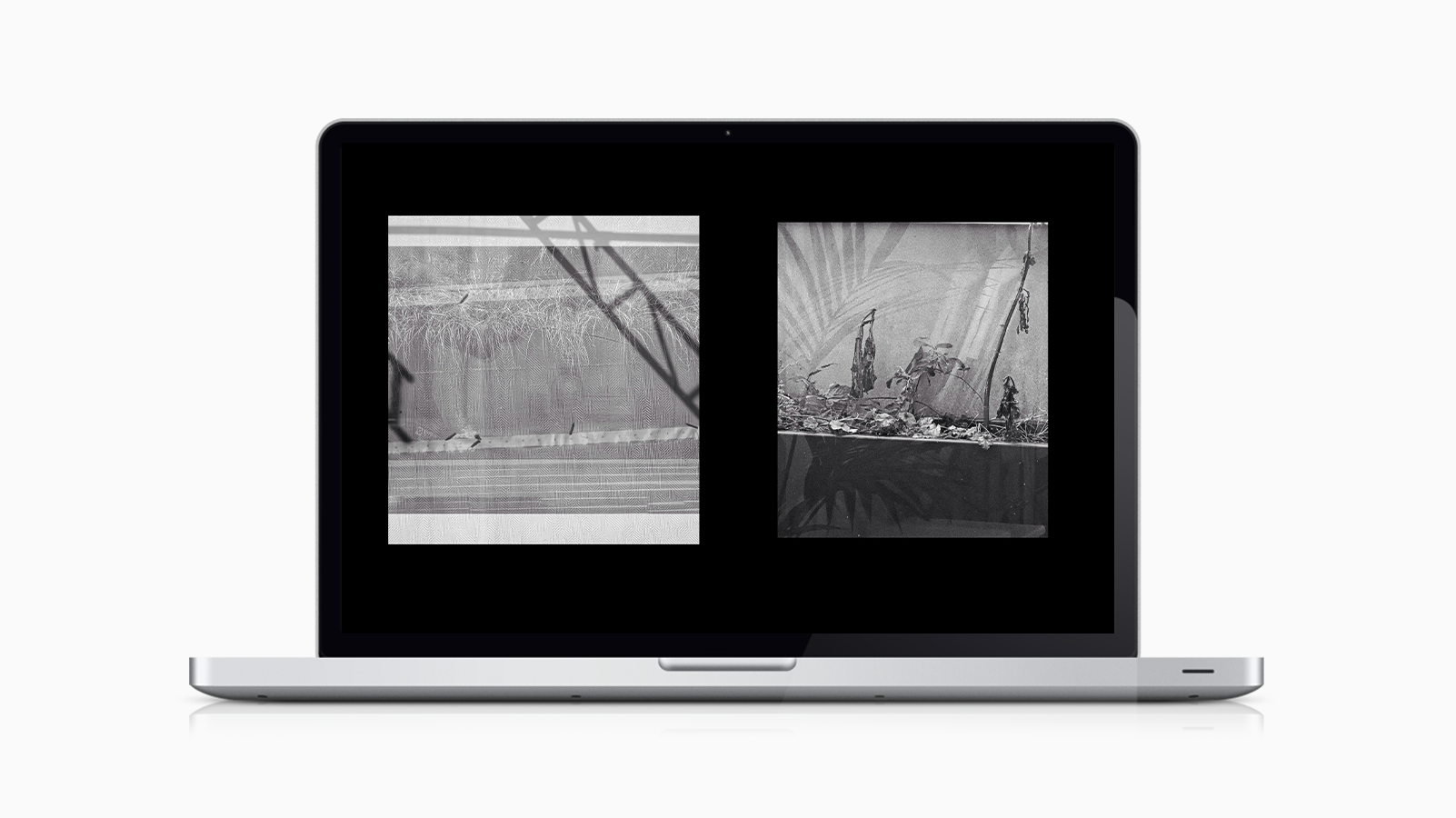
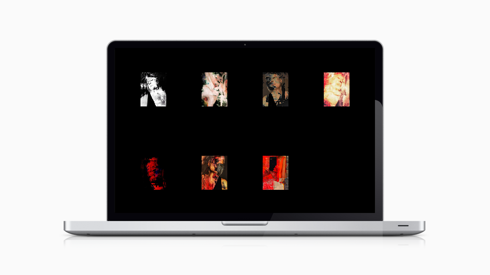
'Beauty' + 'Borough Secret Garden' Project Pages
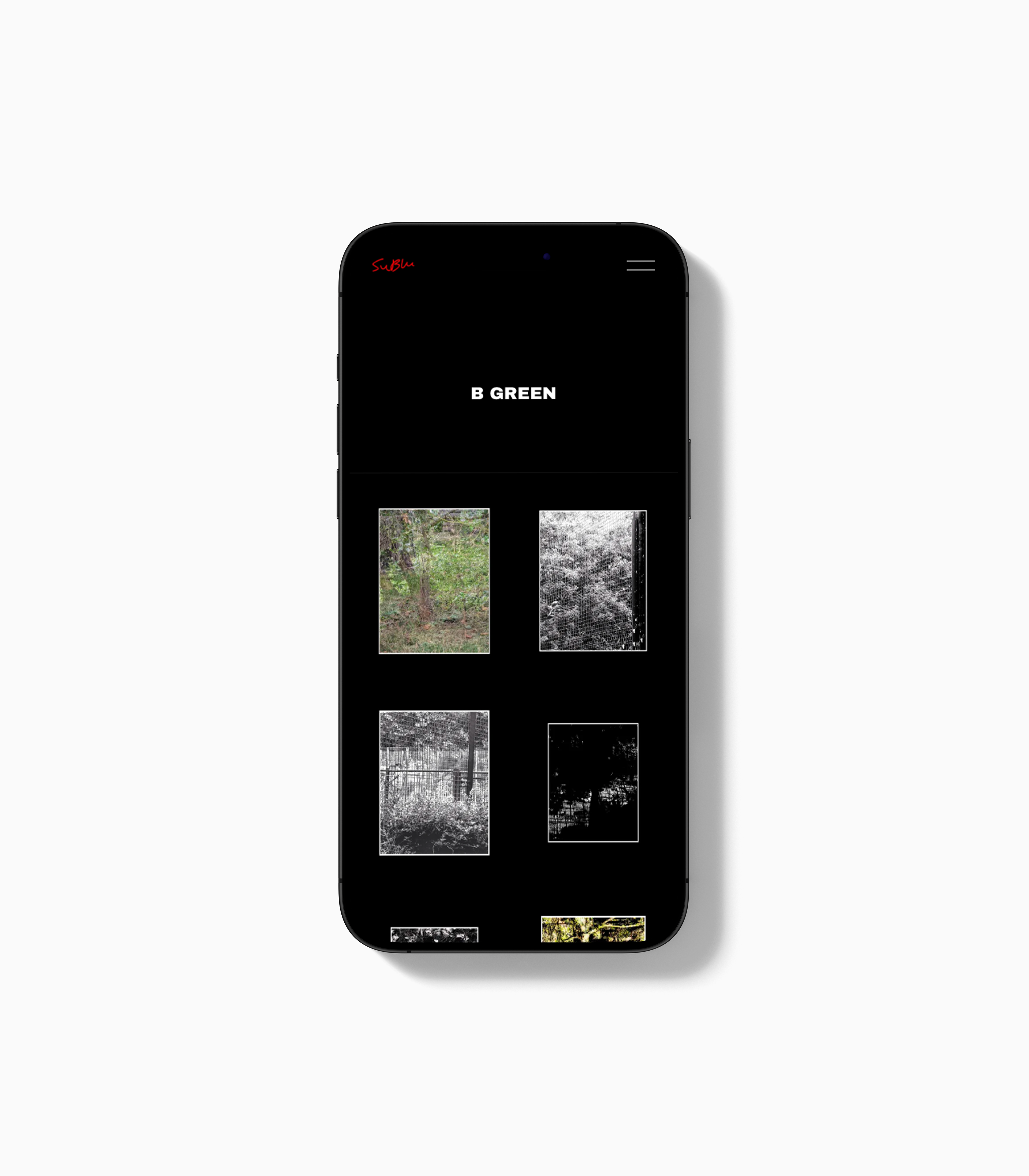
'B Green' Project Page on Mobile
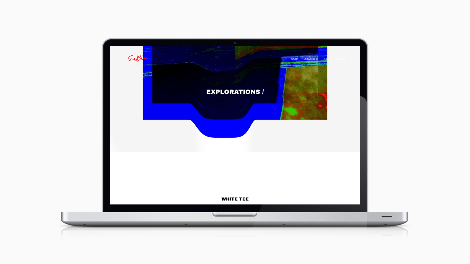
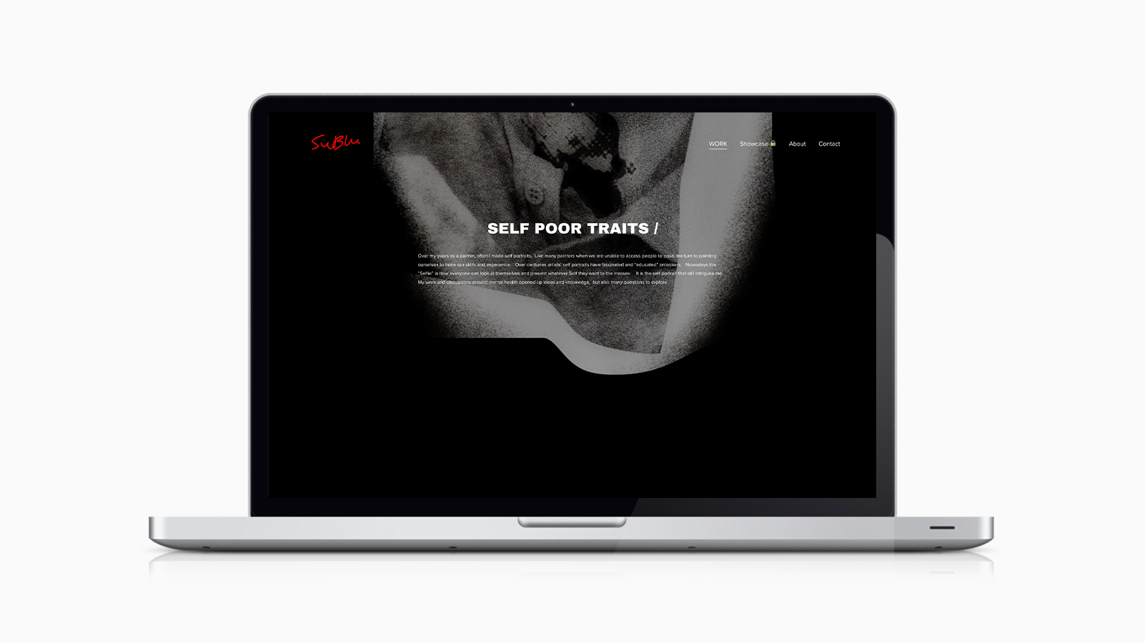
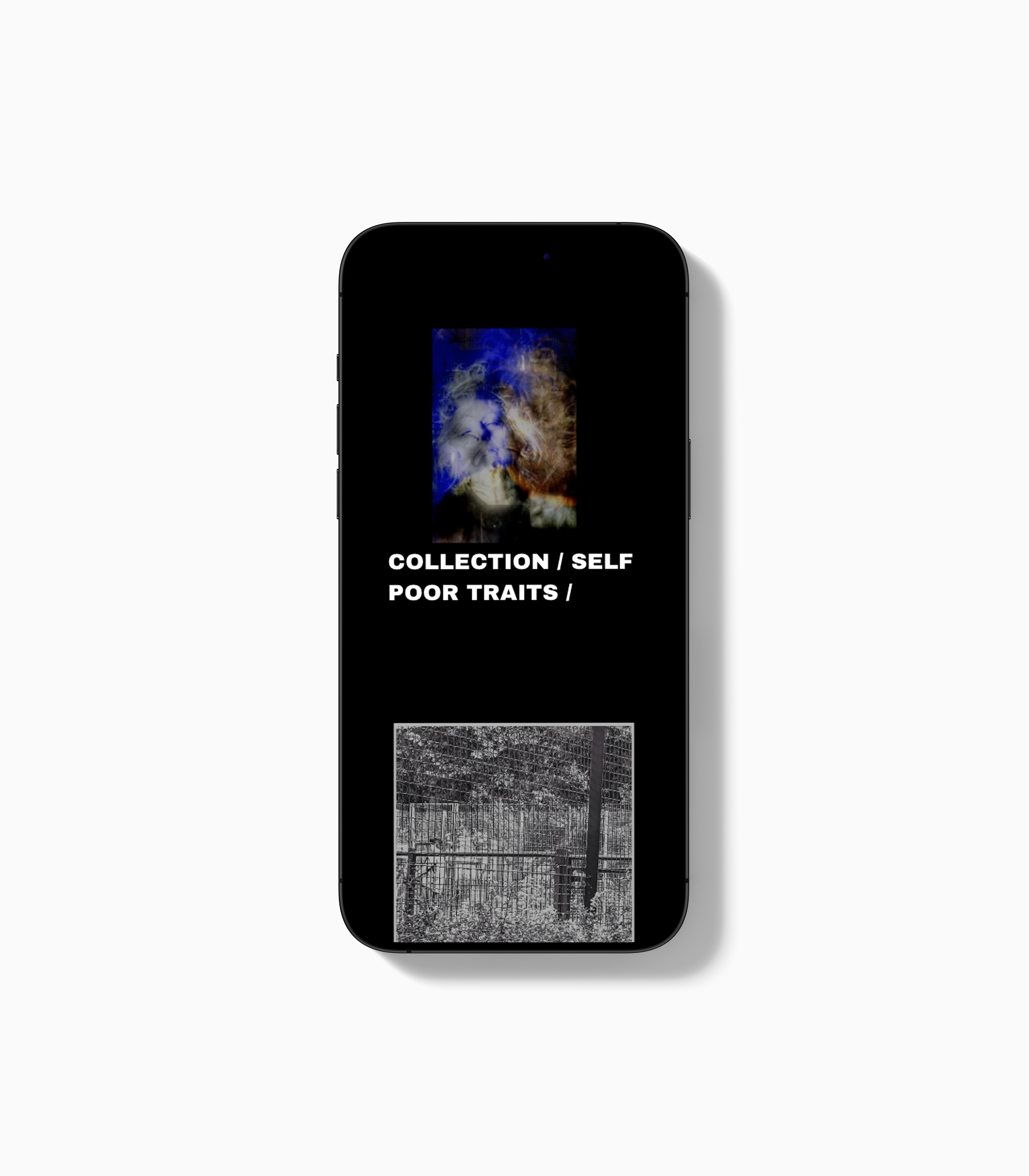
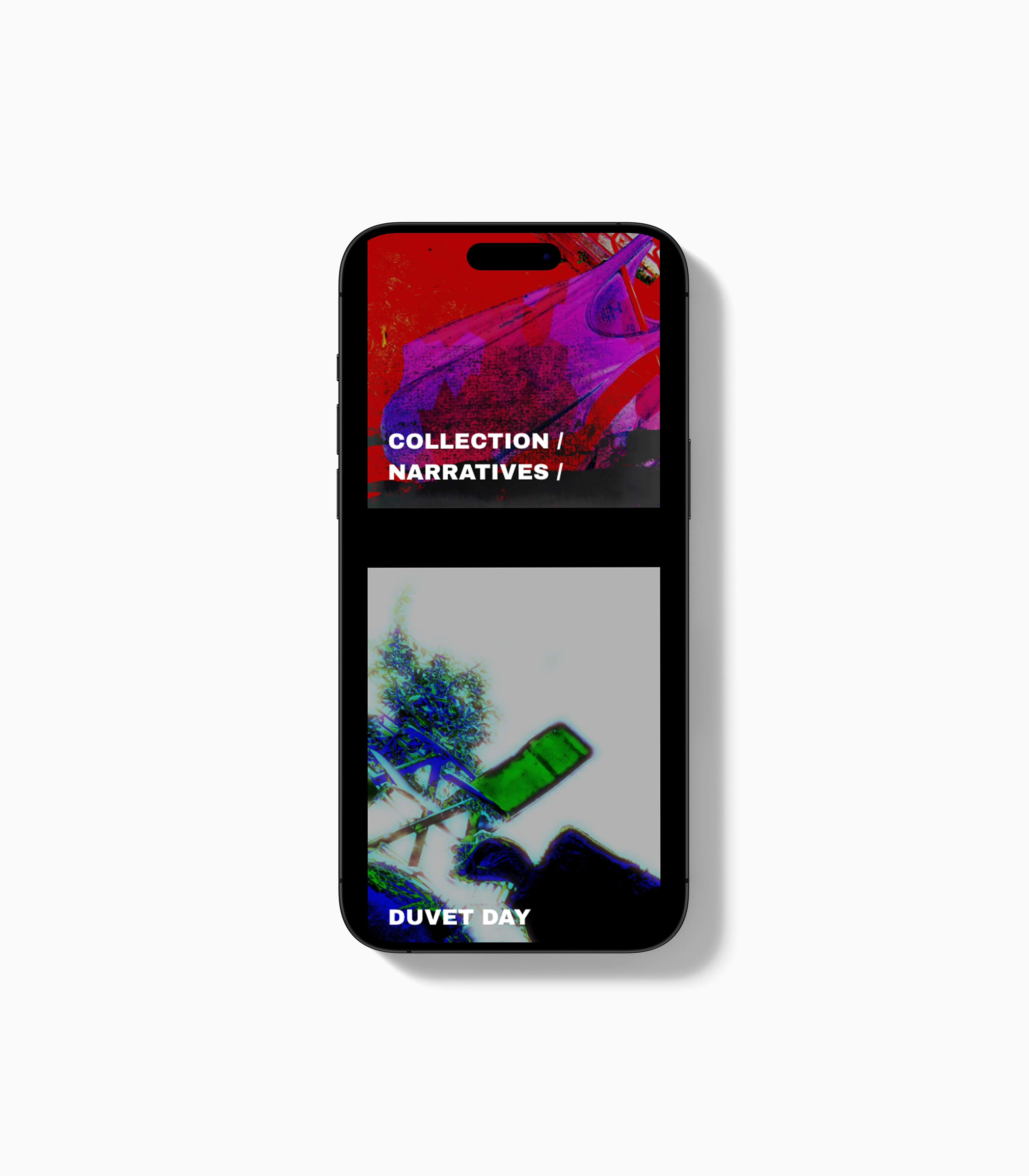
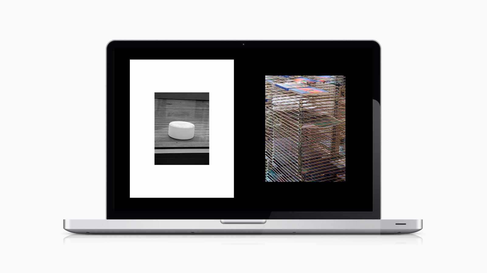
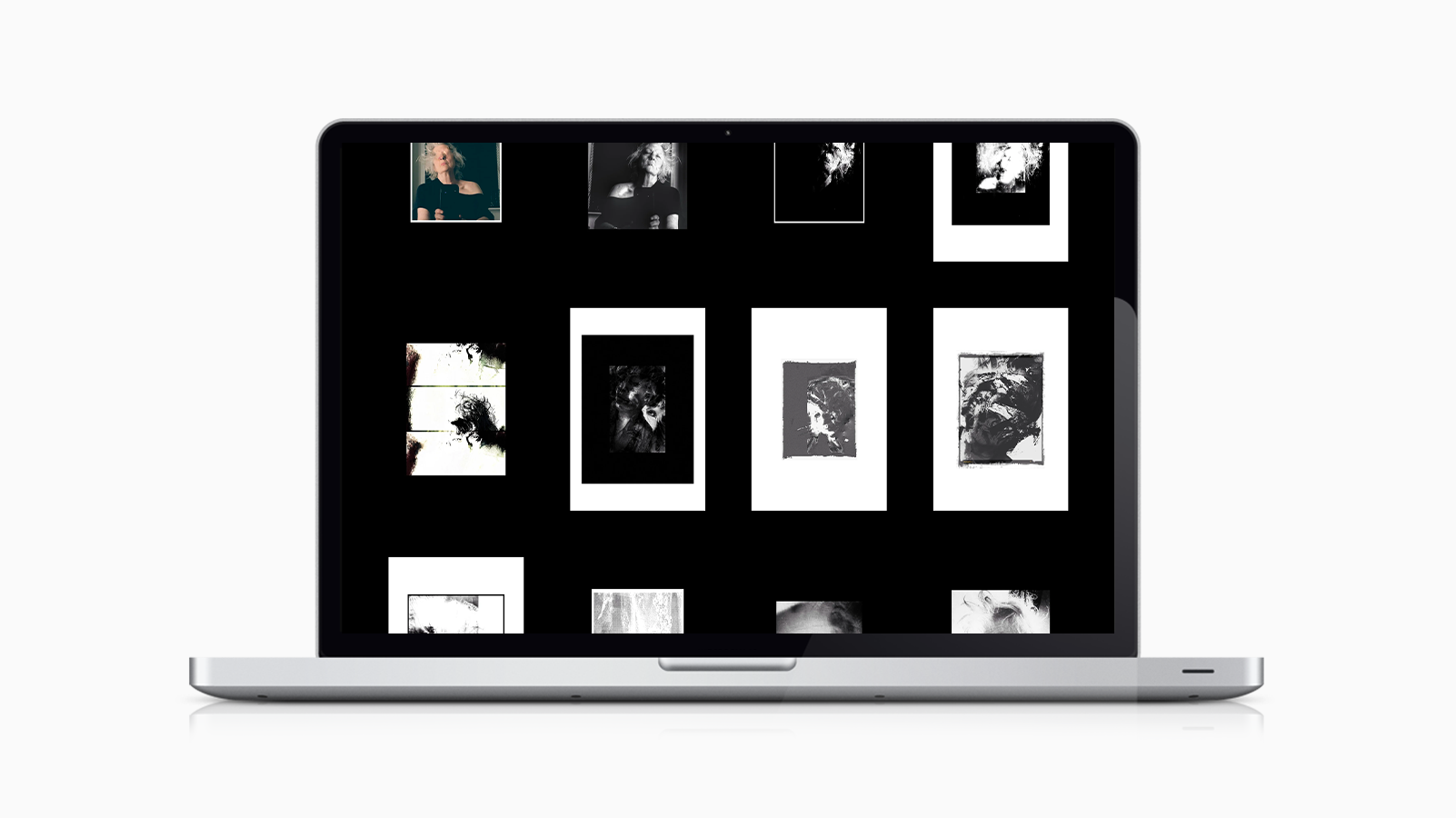
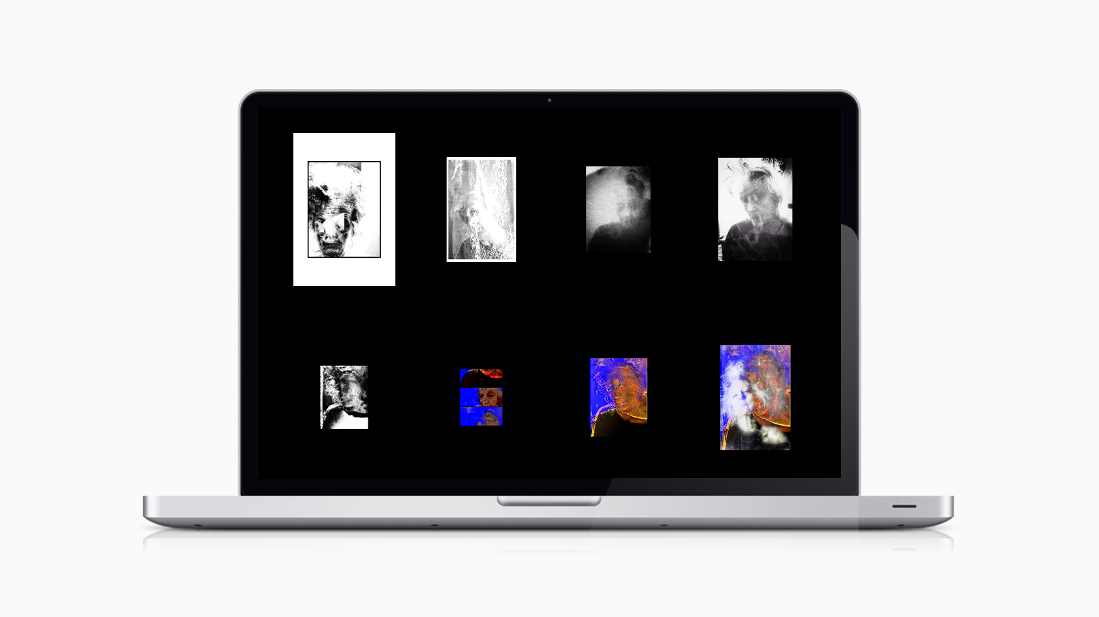
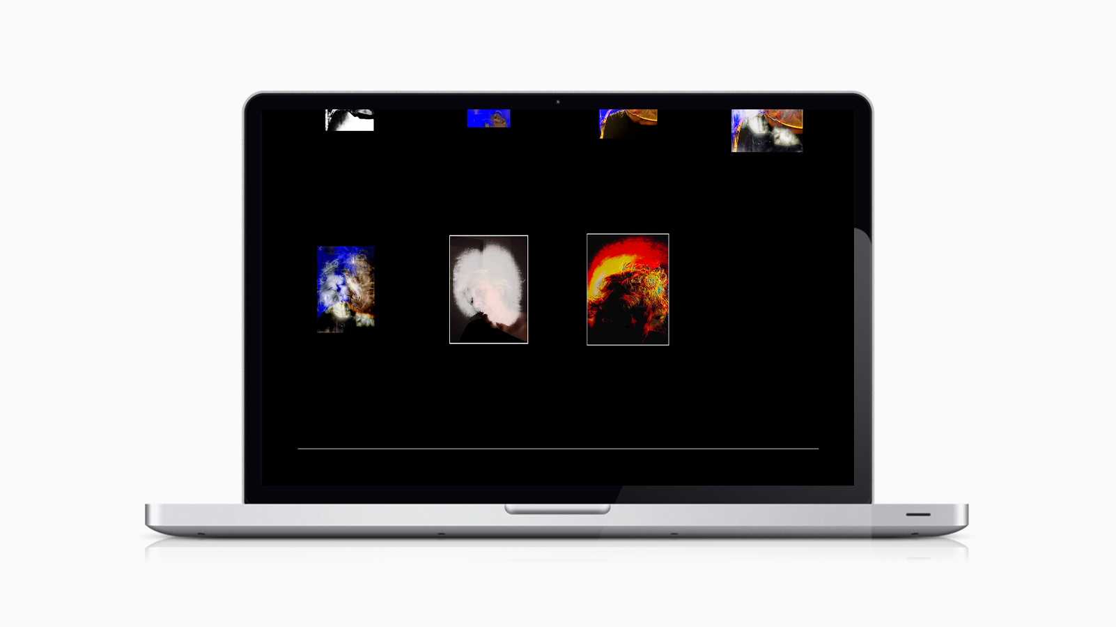
'Explorations' + 'Self Poor Traits' Collection Pages
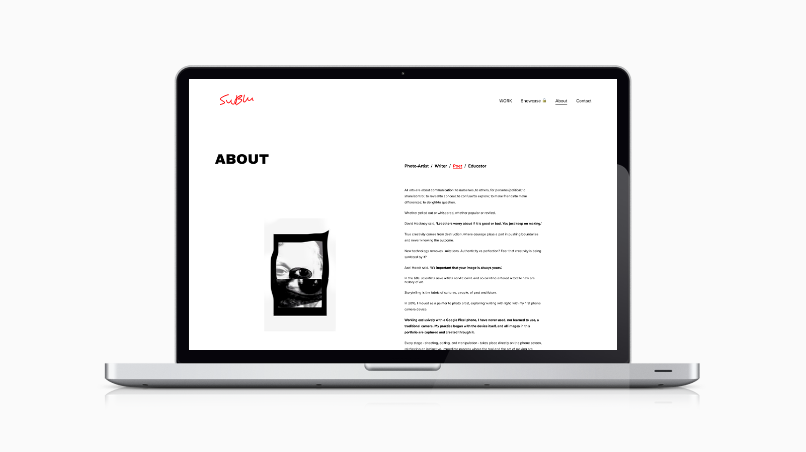
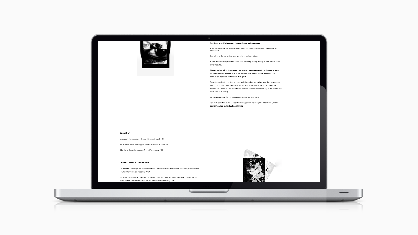
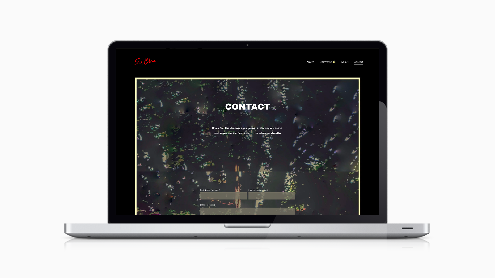
'About' + 'Contact' Pages
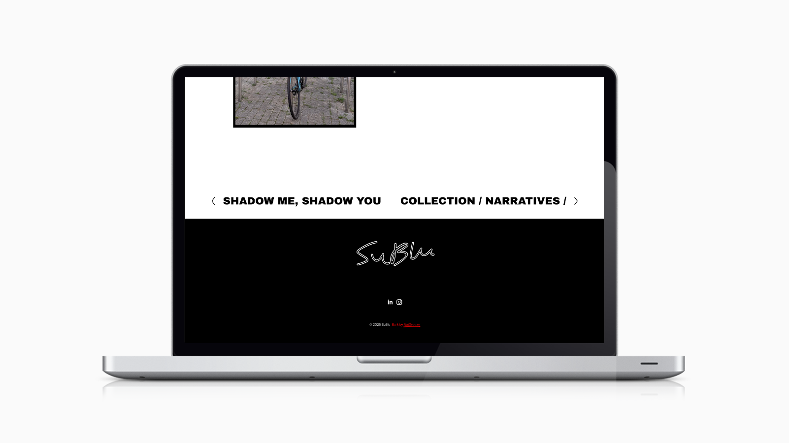
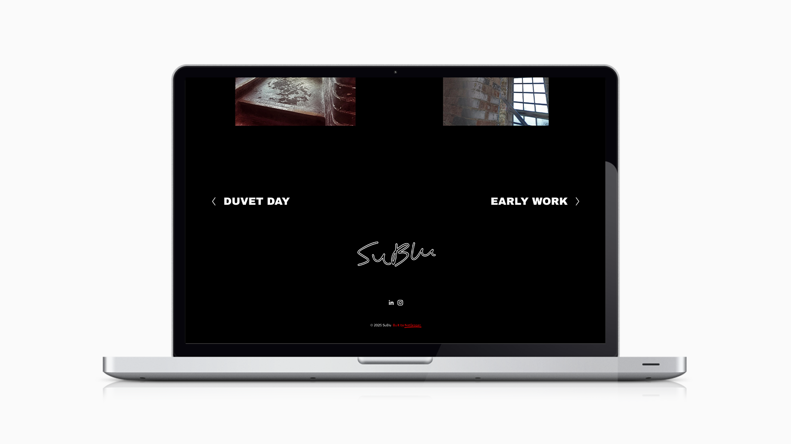
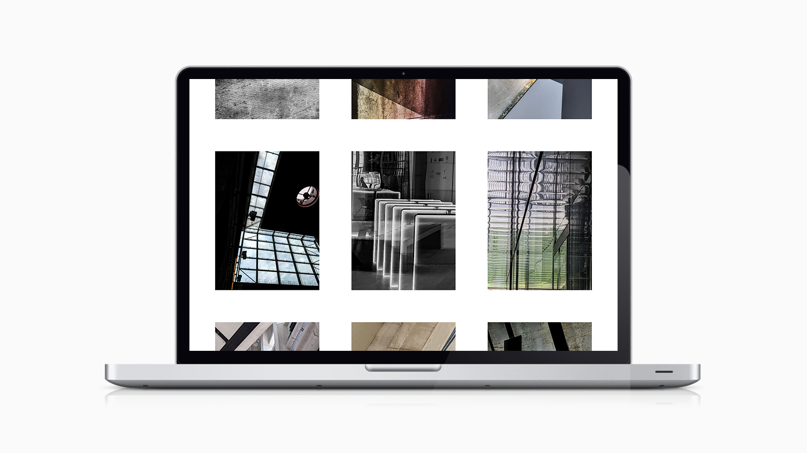
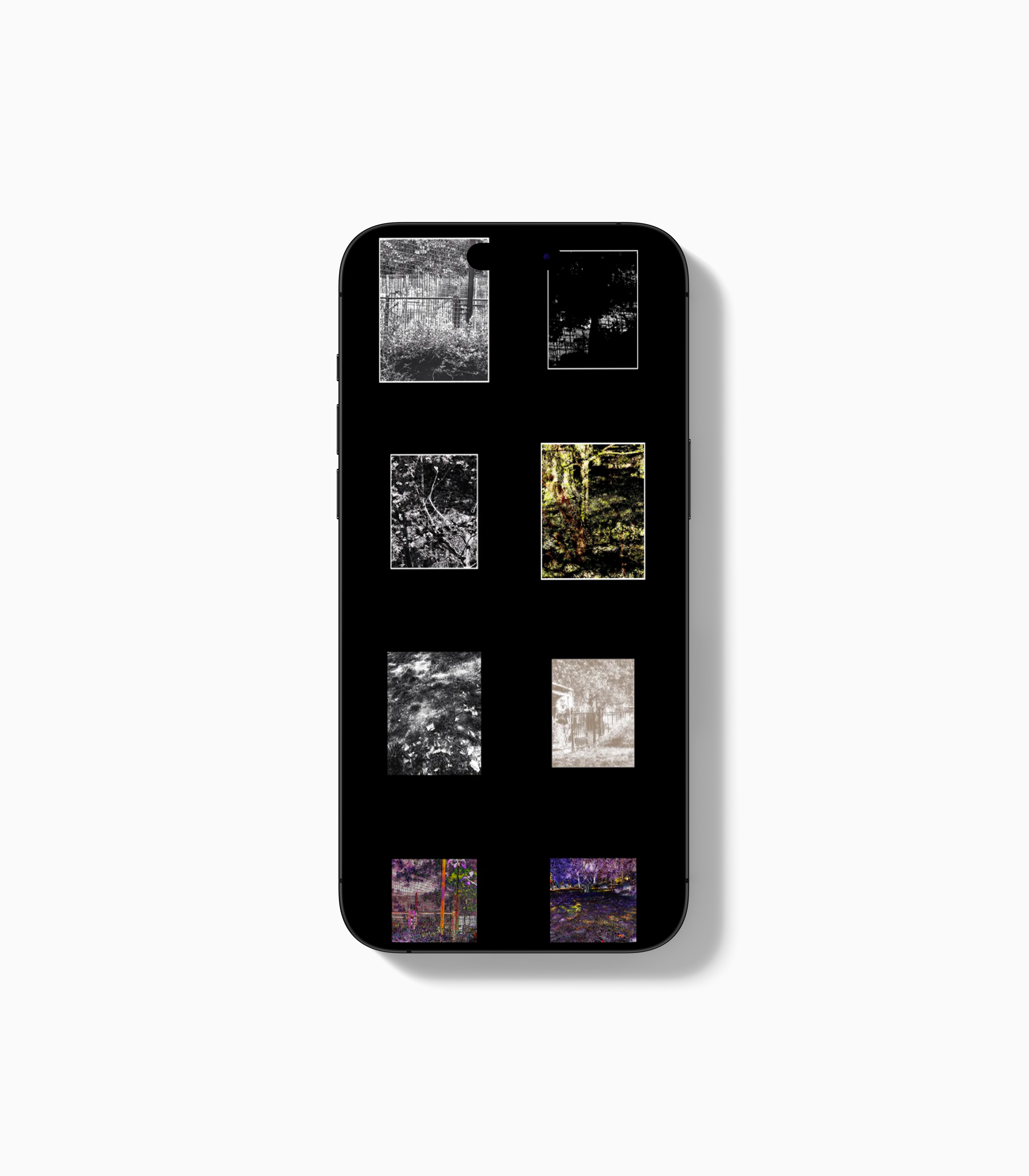
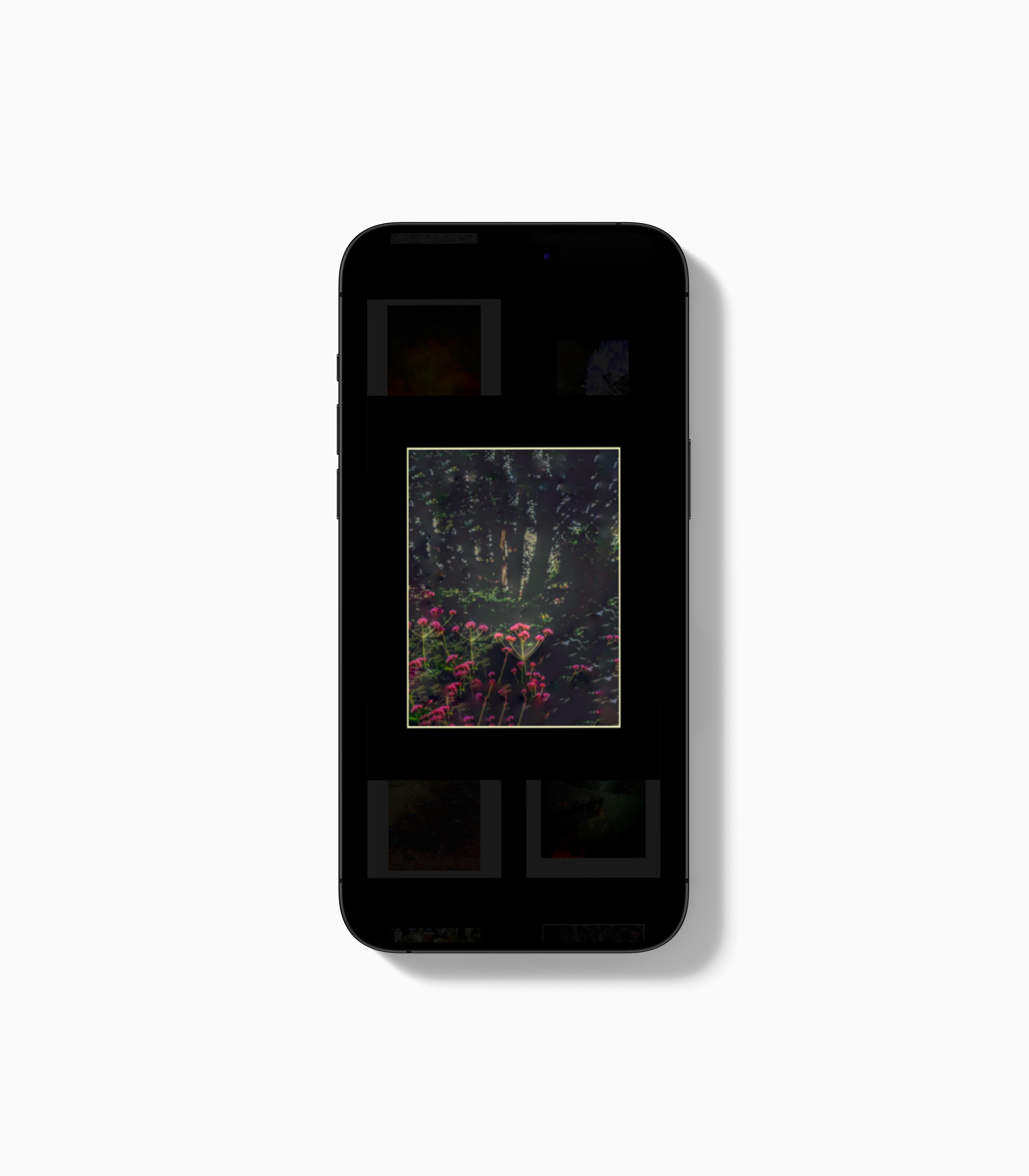
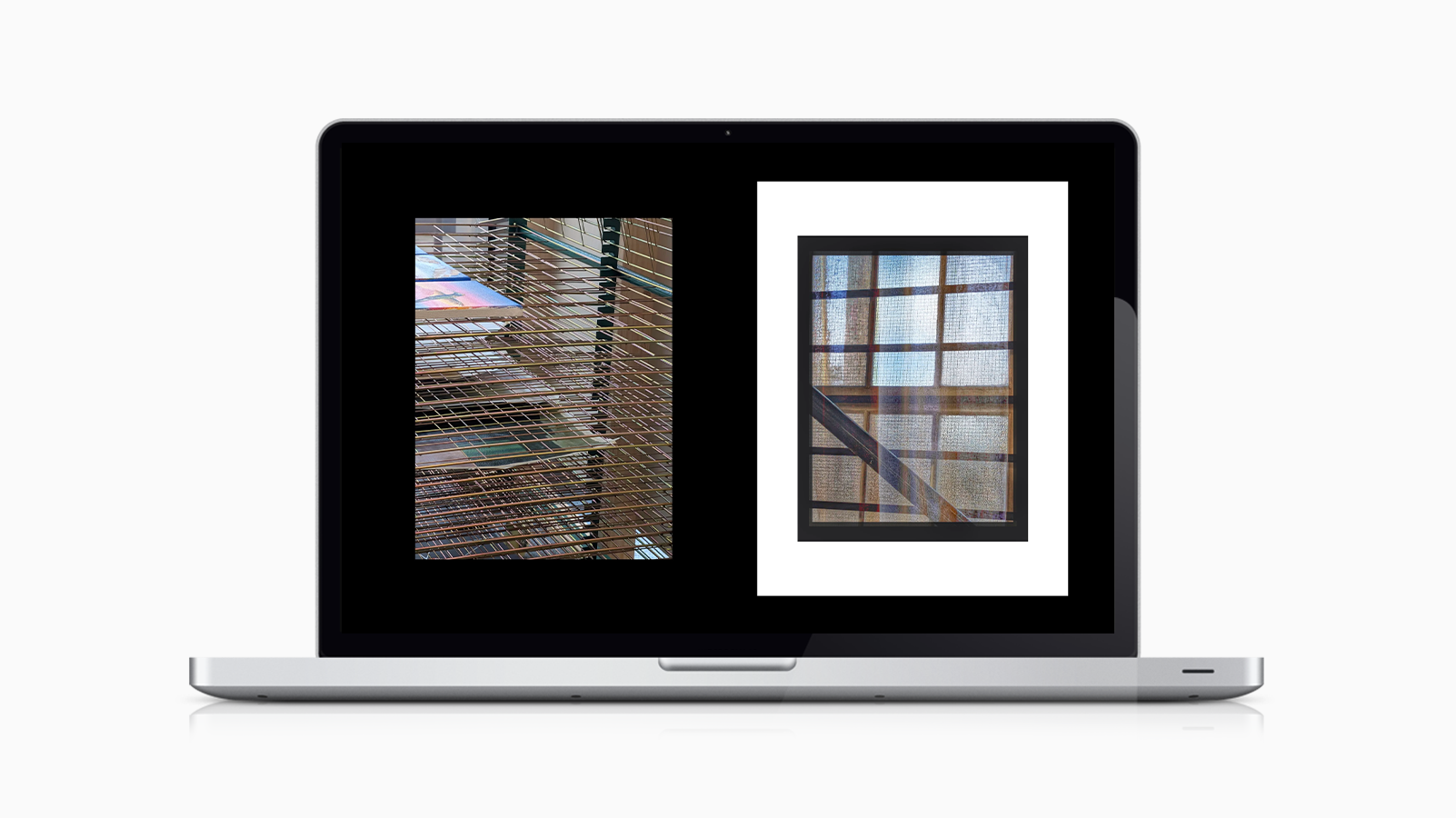
Navigation examples between projects
Print & Brand Extensions
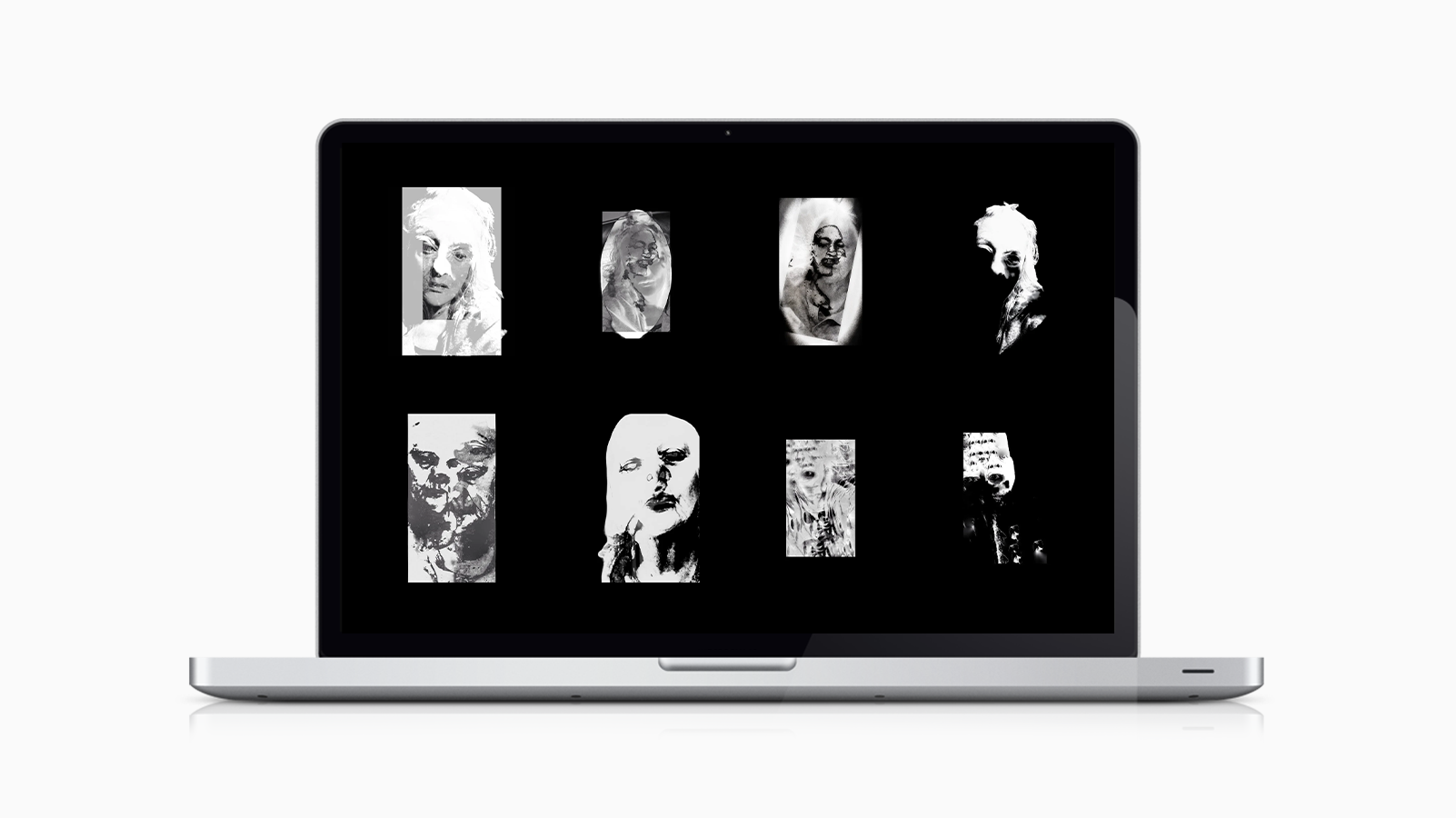
Book Design - Titled "HEADS"
A printed extension of the practice, translating the digital identity into a physical editorial format.
Business Cards
Dual-sided cards featuring SuBlu’s artwork, printed on heavyweight stock with a distinctive red seam - extending the brand system into a tactile experience.
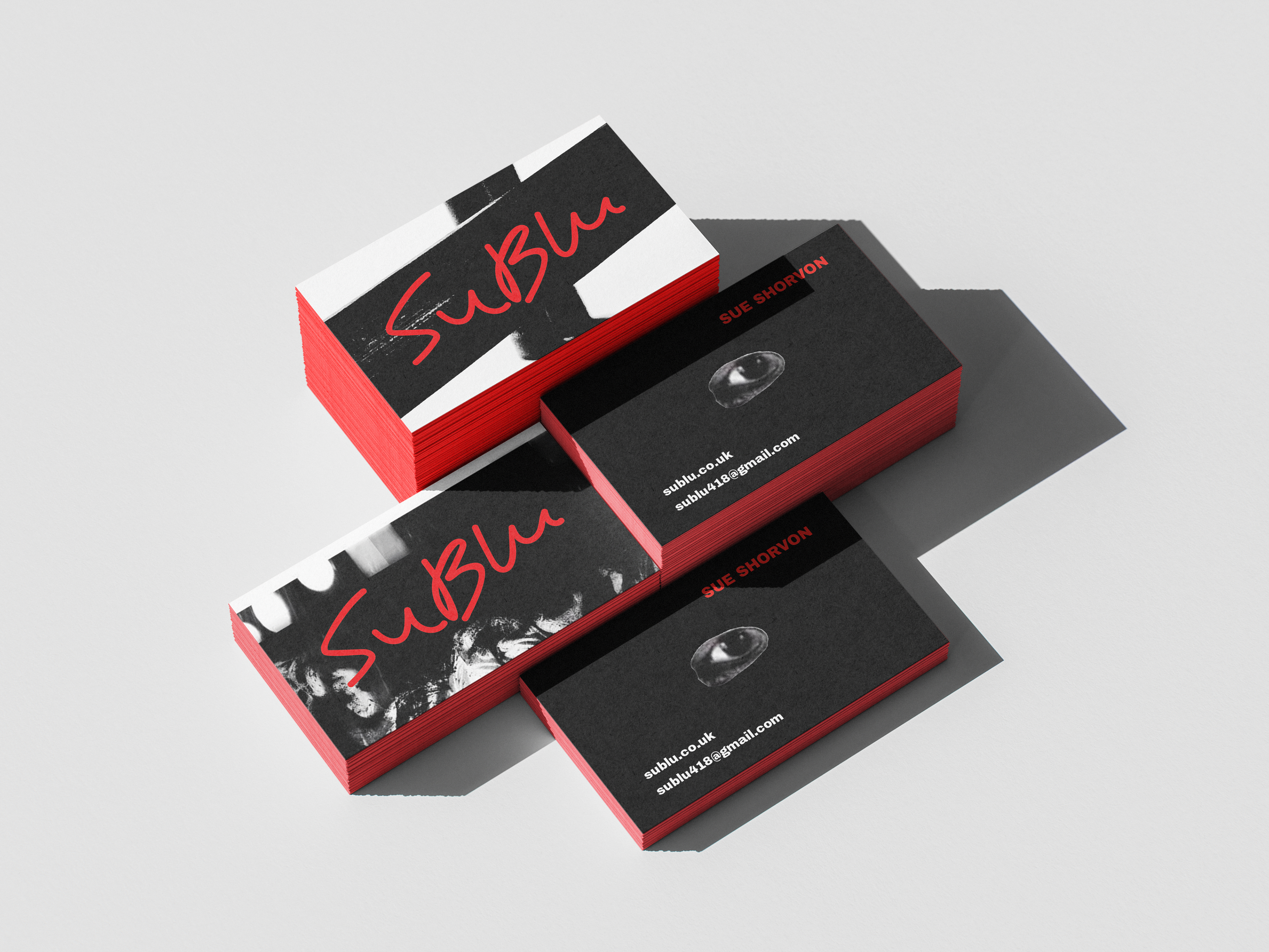
SuBlu Dual-sided Business Cards featuring red seam
THE RESULT
SuBlu evolved from an unstructured archive into a cohesive brand and digital platform designed to guide how the work is experienced.
The new experience:
✔ Transforms a large, complex body of work into a structured, navigable system
✔ Introduces clear entry points through collections and thematic groupings
✔ Creates a more intentional viewing journey from discovery to deeper engagement
✔ Balances emotional expression with clarity, structure, and usability
✔ Establishes consistency across digital and physical touchpoints
Rather than presenting the work as static content, the platform now encourages exploration - helping audiences move from initial discovery into a more considered understanding of the practice.
The result is a focused, immersive portfolio system that strengthens both the artist’s presence and the way the work is experienced - positioning SuBlu for future exhibitions, commissions, and broader professional opportunities.
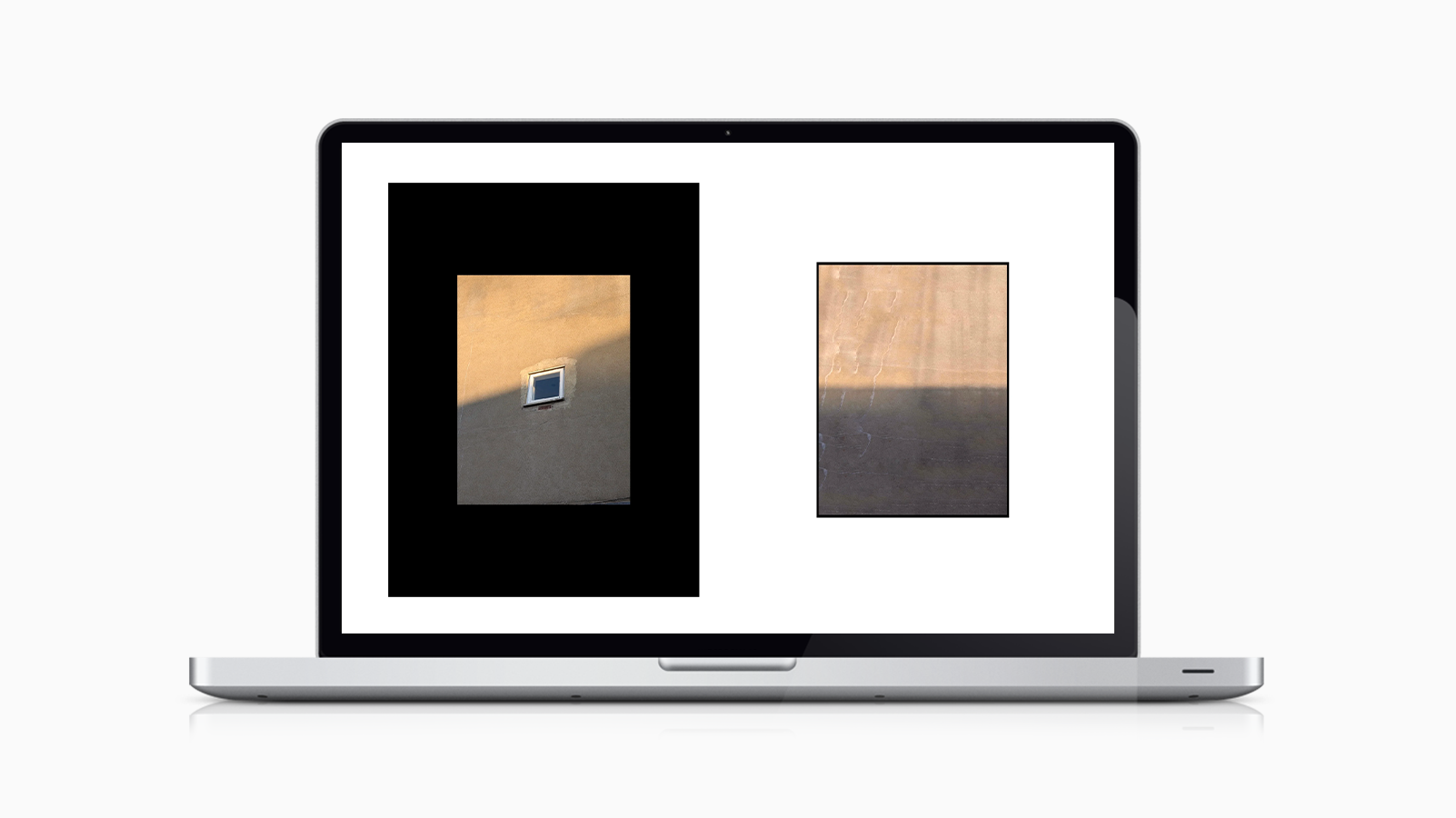
Various Project Pages
DELIVERABLES
✔ Logo design (refined from original sketch)
✔ Brand identity system (colour, typography, visual language)
✔ Website design & build (Squarespace)
✔ Content curation & editing
✔ Digital exhibition (Showcase)
✔ Book design - HEADS
✔ Business card design
✔ Brand identity system (colour, typography, visual language)
✔ Website design & build (Squarespace)
✔ Content curation & editing
✔ Digital exhibition (Showcase)
✔ Book design - HEADS
✔ Business card design
Services provided: Logo Design / Branding / Print Design / Web Design + build